
Piktochart
Create and collaborate on infographics, reports, posters, presentations, and flyers easily with absolutely no design experience.
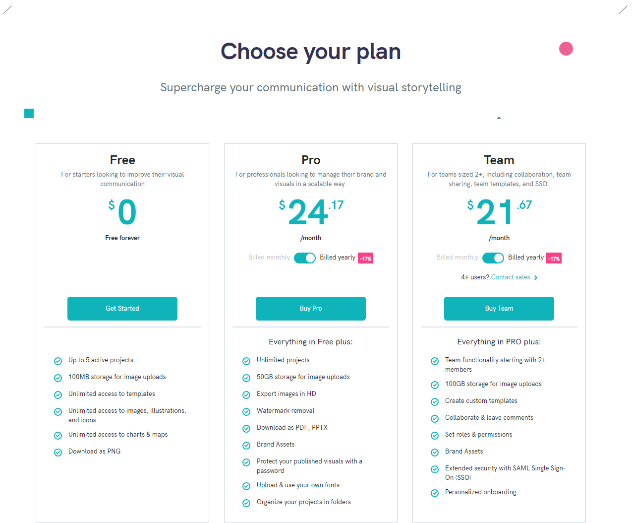
Piktochart Pricing Page Design
$0 - $49 3 Plans
Launch Website
Try Piktochart for free!
This Piktochart pricing section is effective for several reasons:
1. Clear Hierarchy and Visual Appeal:
- Headline Focus: “Choose your plan” is a clear and direct call to action. “Supercharge your communication with visual storytelling” highlights the value proposition.
- Tiered Structure: “Free,” “Pro,” and “Team” tiers are clearly labeled and visually separated.
- Visual Cues:
- The pricing is prominently displayed with a clear “per month” format.
- Checkmarks effectively indicate feature availability in the comparison table.
- The “Get Started” and “Compare plans and features” buttons are visually distinct.
- The use of color accents on the sides of the page is visually appealing.
- Layout: The layout is clean, organized, and easy to follow, with consistent formatting.
2. Value-Based Differentiation:
- Target Audience: Each tier is targeted to different user groups (free users, individual professionals, teams).
- Feature List: The comparison table clearly outlines the differences between the tiers, emphasizing the added value of the higher tiers.
3. Transparent Pricing:
- Pricing Information: The monthly prices are clearly displayed for all tiers.
- Free Tier: The “Free” tier is clearly marked as $0.
4. Addressing Different User Needs:
- Tier Names: The tier names suggest different levels of features and capabilities.
- Feature Availability: The feature availability caters to different needs, from basic free access to advanced team collaboration features.
5. Strategic Use of Information:
- Call to Action: “Get Started” and “Compare plans and features” buttons are prominently placed, encouraging user engagement.
- Other Information: The comparison table allows users to easily see the differences between each plan. The categorization of features (Reports, Collaboration & High Volume, Branding, etc.) makes it easy to find relevant information. The “Free” tier provides a low-barrier entry point. The inclusion of features like “Live video recording” and “Team collaboration” highlights key benefits.