
IFTTT
Get started with IFTTT, the easiest way to do more with your favorite apps and devices for free.
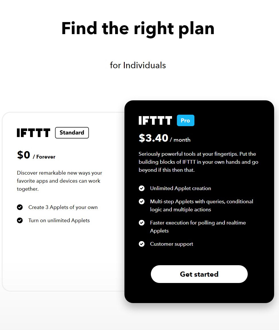
IFTTT Pricing Page Design
$0 - $49 2 Plans
Launch Website
Make your home more relaxing. Make your work more productive. Keep your data private and secure. We believe every thing works better together.
The IFTTT pricing section is effective for several reasons:
- Clear Hierarchy and Visual Appeal:
- Headline and Targeting: “Find the right plan” is direct and user-focused, while “for Individuals” clarifies the target audience.
- Tiered Structure: Two distinct tiers (Standard, Pro) are clearly displayed with visual separation through color and card design.
- Pricing Clarity: Prices are prominently displayed for each tier, with “$0 / Forever” clearly indicating the free option.
- Visual Cues: Checkmarks clearly indicate included features, making it easy to compare tiers. The black card design for “Pro” stands out, highlighting the paid option.
- Call to Action: “Get started” buttons are clearly visible for both tiers.
- Layout: The layout is clean, organized, and easy to scan.
- Value-Based Differentiation:
- Target Audience: The “for Individuals” targeting makes it clear who these plans are designed for.
- Feature Progression: The descriptions and feature list clearly show the increasing functionality and complexity of the Pro tier.
- Key Differentiators: Unlimited Applet creation, multi-step Applets, faster execution, and customer support are used as key differentiators.
- Focus on Benefits: The messaging focuses on the benefits users will receive, such as increased control, automation, and support.
- Transparent Pricing:
- Clear Pricing: Prices are clearly displayed for each tier, including the free option.
- Addressing Different User Needs:
- Tier Names: The names suggest different levels of service and functionality.
- Target Audience Description: The “for Individuals” targeting helps users identify the most suitable plan.
- Feature Set: The features offered in each tier cater to different needs and budgets.
- Strategic Use of Information:
- Call to Action: The prominent “Get started” buttons encourage conversions.
- Concise Messaging: The descriptions and feature lists are brief and to the point.
- Visual Clarity: The use of checkmarks and the contrasting card designs makes it easy to compare features across tiers.
- Free Tier: The “FREE” tier lowers the barrier to entry and encourages users to try the service.
- Pro Tier Highlight: The black card design for “Pro” draws attention to the paid option and its enhanced features.