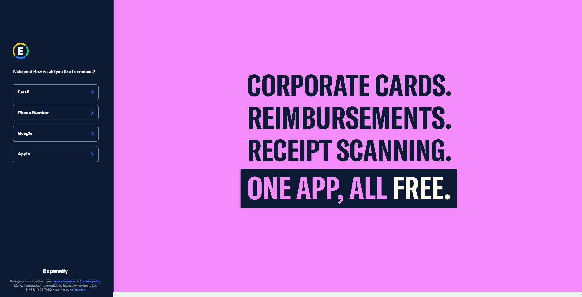
Sign up or log in to automate your preaccounting process for expenses, bills, invoices, and more! Start a free trial and see why more than 10 million people prefer Expensify for all their preaccounting tasks.
This Expensify hero section is exceptionally effective for several key reasons:
1. Bold, Direct Messaging: Uses a staccato, three-line format for core features: “CORPORATE CARDS. REIMBURSEMENTS. RECEIPT SCANNING.”
Delivers a powerful punch line: “ONE APP, ALL FREE.”
Each line acts as a mini-headline, making benefits instantly scannable
2. Strategic Sign-up Panel: Clean, left-aligned dark panel creates clear visual separation
Multiple sign-up options (Email, Phone, Google, Apple) reduce friction
Welcome message creates a friendly, inviting tone
Essential legal information is present but unobtrusive
3. Striking Color Scheme: Bold pink background is unexpected for a financial/corporate tool
Creates instant memorability and brand differentiation
High contrast between the dark panel and pink makes text highly readable
Challenges traditional “corporate” design conventions
4. Minimalist Design: No unnecessary images or decorative elements
Typography and color do all the heavy lifting
White text on colored background creates maximum impact
Plenty of whitespace makes the message breathe
5. Perfect Value Proposition: Addresses pain points directly (cards, reimbursements, receipts)
Emphasizes simplicity (“ONE APP”)
Highlights the pricing benefit (“ALL FREE”)
Each element builds to create a compelling story
The design succeeds because it breaks fintech conventions while maintaining professionalism, and communicates complex functionality in an incredibly simple way.