-
Clear and Concise Headline:
“Software Joyfully” is a short, memorable, and intriguing headline. It immediately sets a positive and aspirational tone. While it’s a bit abstract, it suggests a user-friendly and enjoyable experience with the software.
-
Value Proposition:
The text below the headline expands on the value proposition: “Anything is possible with the world’s #1 product development software.”
This highlights key aspects:
- Comprehensive capabilities (“Anything is possible”).
- Market leadership (“world’s #1”).
- Focus on product development.
-
Strong Call-to-Action (CTA):
“Start free” is a clear, prominent, and action-oriented CTA. It encourages immediate engagement and lowers the barrier to entry.
-
Visual Reinforcement:
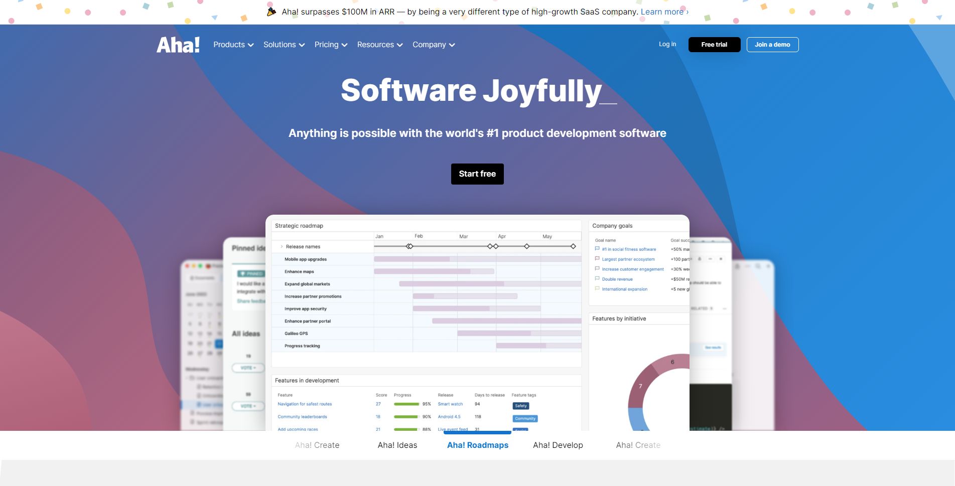
- Screenshot of the Platform: The prominent screenshot of the Aha! platform provides a concrete example of the product in action and visually reinforces the “product development software” aspect of the offering. The interface shown suggests various features, including roadmapping, ideation, and project management tools.
- Modern and Clean Design: The overall design is modern, clean, and professional. The use of white space and clear typography makes the information easy to digest. The color palette is consistent with Aha!’s branding.
-
Strategic Design:
- Color Palette: The use of a clean white background with blue and pink accents creates a professional and trustworthy feel. The colors are consistent with Aha!’s branding.
- Typography: The use of clear and readable fonts ensures the information is easily digestible.
- Visual Hierarchy: The headline is the most prominent element, followed by the screenshot, the value proposition text, and the CTA, creating a clear visual hierarchy.
-
Focus on the Target Audience:
The language and messaging are clearly targeted at product managers, product teams, and businesses looking to improve their product development processes.
-
Unique Aspects:
- The combination of a strong headline, clear value proposition, and prominent CTA makes this a highly effective hero section.
- The claim of being the “world’s #1 product development software” is a bold statement and a key differentiator.
- The prominent display of “Aha! Ideas,” “Aha! Roadmaps,” “Aha! Develop,” and “Aha! Create” sections at the bottom highlights the comprehensive suite of tools offered by Aha! and reinforces their expertise in product development.
- The “Aha! surpasses $100M in ARR…” banner at the top provides strong social proof and builds credibility.