-
Clear and Concise Headline:
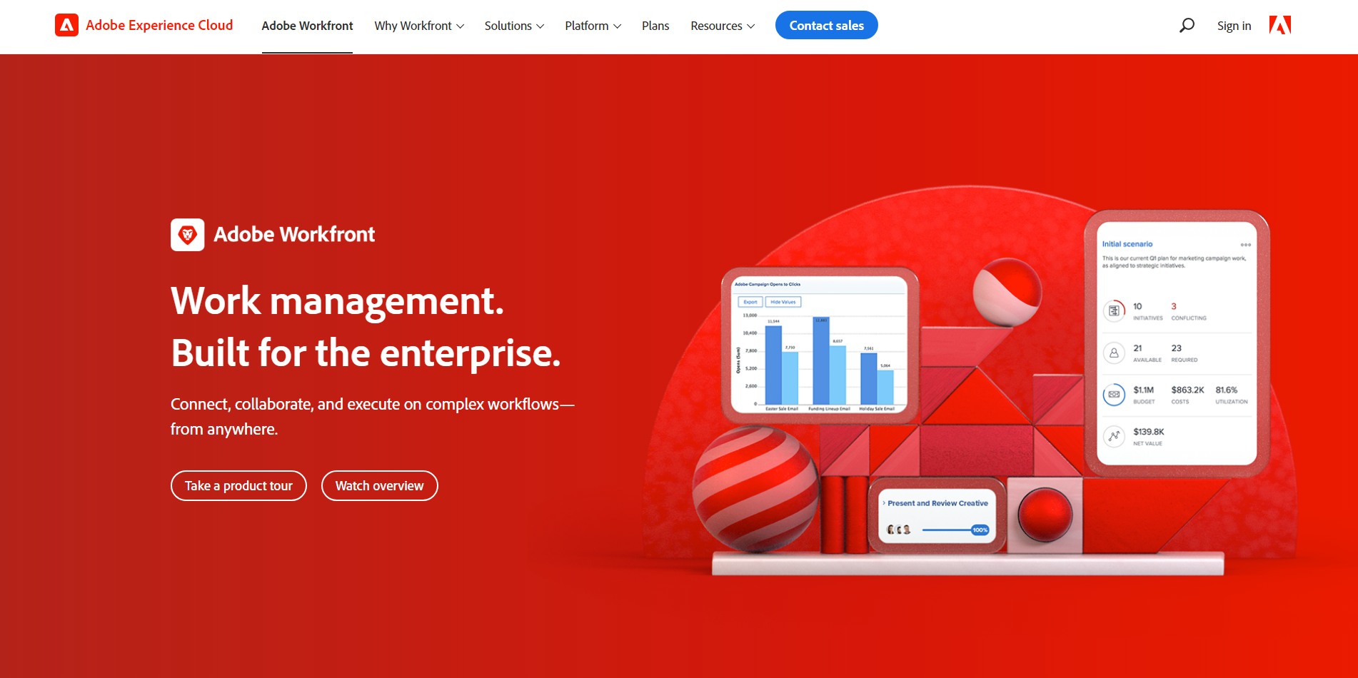
“Work management. Built for the enterprise.” This is a strong, concise, and direct headline. It immediately communicates the core offering and target audience. The phrase “built for the enterprise” emphasizes scalability and robust functionality.
-
Value Proposition:
The text below the headline expands on the value proposition: “Connect, collaborate, and execute on complex workflows—from anywhere.”
This highlights key benefits:
- Enhanced connection and collaboration.
- Efficient execution of complex workflows.
- Accessibility from any location.
-
Strong Call-to-Action (CTA):
“Take a product tour” and “Watch overview” are both clear, prominent, and action-oriented CTAs. They offer different engagement paths: a guided product tour and a general overview video. This caters to different user preferences and stages of the buying journey.
-
Visual Reinforcement:
- Bold and Modern Design: The overall design is bold, modern, and professional. The use of red and white creates a strong visual contrast and immediately grabs attention. The red is consistent with Adobe’s branding.
- Abstract Graphic with Device Mockups: The abstract graphic with device mockups visually represents the interconnectedness of teams and workflows. The style is clean and professional. The device mockups (tablet and phone) showcase the platform’s interface and suggest accessibility across different devices.
-
Strategic Design:
- Color Palette: The red and white color scheme is bold, modern, and memorable. It’s a distinctive choice that helps Adobe Workfront stand out.
- Typography: The use of clear and readable fonts ensures the information is easily digestible.
- Visual Hierarchy: The headline is the most prominent element, followed by the value proposition text, the CTAs, and the graphic, creating a clear visual hierarchy.
-
Focus on the Target Audience:
The language and messaging are clearly targeted at enterprise-level businesses and organizations.
-
Unique Aspects:
- The combination of a strong headline, clear value proposition, and prominent CTAs makes this a highly effective hero section.
- Offering two distinct CTAs caters to different user needs and stages of the buying journey.
- The bold color scheme and modern graphic create a visually striking and memorable experience.