The Monday.com hero section is effective for its:
1. Clear and Compelling Headline:
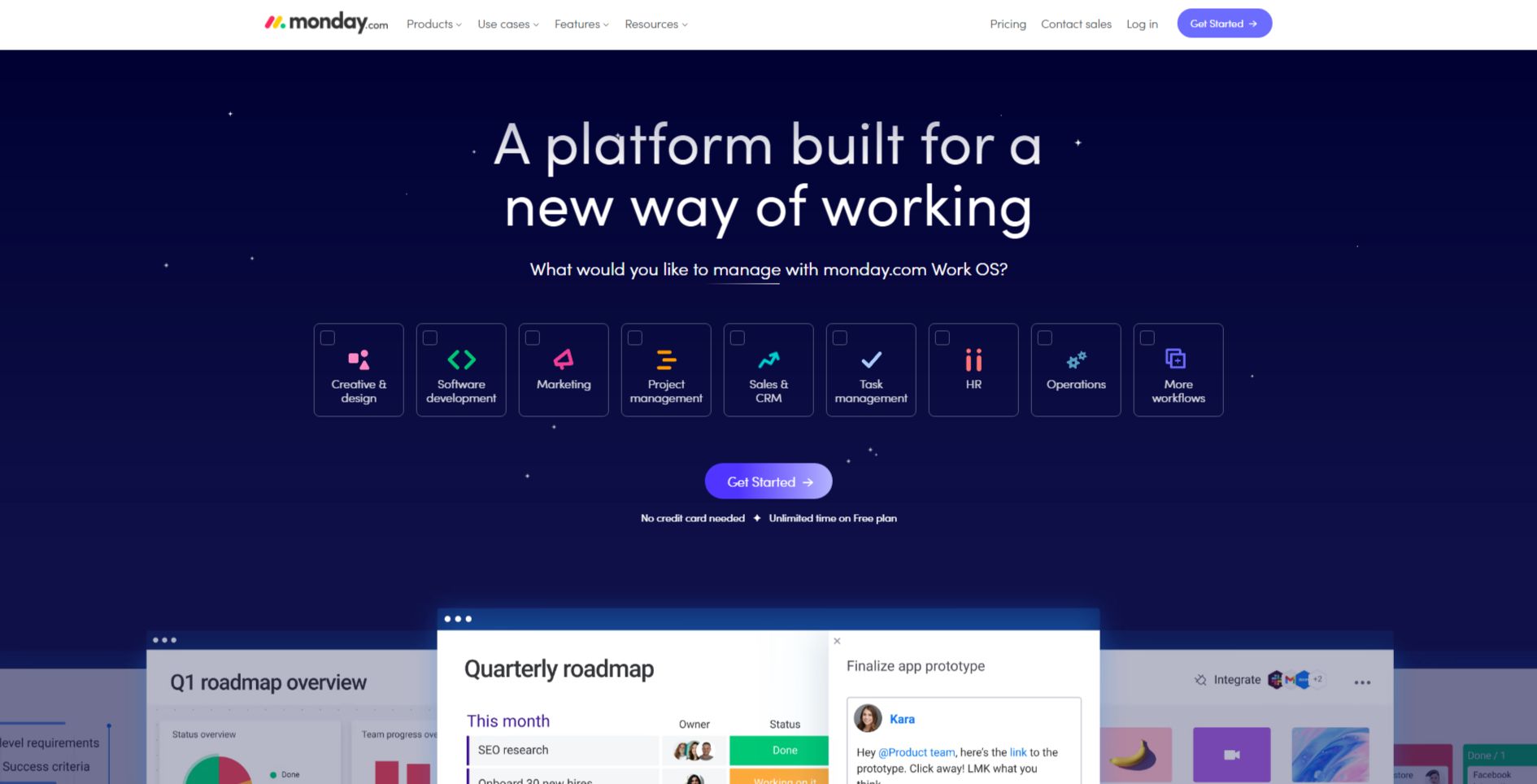
“A platform built for a new way of working” is concise and impactful.
It immediately establishes the core value proposition, positioning Monday.com as a solution that goes beyond traditional project management tools.
It hints at a more modern, flexible, and collaborative approach to work.
2. Value Proposition:
The subheadline, “What would you like to manage with monday.com Work OS?” is a powerful open-ended question.
It invites users to consider the breadth of Monday.com’s capabilities and encourages them to think about how the platform can address their specific work challenges.
3. Strong Call-to-Action (CTA):
“Get Started” is a clear and direct CTA, encouraging users to take the next step and explore the platform firsthand.
The “Unlimited free plan” message further incentivizes users to sign up and experience Monday.com.
4. Visual Reinforcement:
Dark Mode with Vibrant Colors: The dark background with vibrant colors creates a modern and engaging aesthetic, visually appealing to a tech-savvy audience.
Visual Representation of Workflows: The visual representation of different work streams (Creative, Software, Marketing, Project Management, Sales, etc.) using colorful cards effectively communicates the platform’s versatility and its ability to manage various types of projects and workflows.
Dynamic Interface: The glimpse of the Monday.com interface with real-time updates and collaborative features showcases the platform’s dynamic and user-friendly nature.
5. Strategic Design:
Whitespace Utilization: The use of whitespace effectively enhances readability and creates a sense of spaciousness, making the hero section visually appealing and easy to navigate.
Visual Hierarchy: The headline and subheadline are prominently displayed, followed by the visual representation of workflows and the CTA, creating a clear visual hierarchy that guides the user’s attention.
Interactive Elements: The “Get Started” button is prominently displayed and visually appealing, encouraging user interaction.
6. Focus on the Target Audience:
The language and messaging clearly target businesses and teams looking for a modern and flexible work management solution.
The emphasis on a “new way of working,” collaboration, and managing various workflows resonates with the needs and priorities of this audience.
7. Unique Aspects:
The open-ended question “What would you like to manage with monday.com Work OS?” invites users to reflect on their own work challenges and consider how Monday.com can address their specific needs.
The visual representation of different work streams effectively demonstrates the platform’s versatility and its ability to cater to a wide range of use cases.