The Mailchimp hero section is effective for its:
1. Clear and Compelling Headline:
“Grow your audience and your revenue” is concise, impactful, and immediately establishes the core value proposition.
It directly addresses the key business goals of most marketers – expanding their reach and driving sales.
2. Value Proposition:
The subheadline, “Win over new and repeat customers by sending emails and automations from a marketing platform that has expert advice built in,” elaborates on the platform’s benefits.
It highlights how Mailchimp helps businesses achieve their growth objectives through effective email marketing strategies and provides valuable insights and guidance.
3. Strong Call-to-Action (CTA):
“Sign Up” is a clear and prominent CTA, encouraging users to take the next step and experience the platform firsthand.
The placement of this button is strategically positioned for maximum visibility.
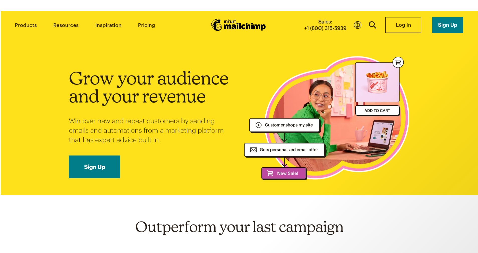
4. Visual Reinforcement:
Focus on Customer Journey: The image depicts a customer interacting with an online store, browsing products, adding items to their cart, and receiving personalized email offers. This visual narrative effectively conveys the customer journey and how Mailchimp can be used to engage customers at each stage.
Emphasis on Action: The visual elements, such as the “ADD TO CART” button and the email notifications, convey a sense of action and engagement, highlighting the dynamic nature of email marketing.
5. Strategic Design:
Color Palette: The use of a bright yellow background creates a sense of energy, optimism, and growth, aligning with the message of audience and revenue growth.
Typography: The use of a clean and modern font for the headline and subheadline emphasizes the key message and enhances readability.
Visual Hierarchy: The headline and subheadline are prominently displayed, followed by the visual elements and the CTA, creating a clear visual hierarchy that guides the user’s attention.
Whitespace Utilization: The effective use of whitespace enhances readability and creates a sense of spaciousness, making the overall design visually appealing and easy to navigate.
6. Focus on the Target Audience:
The language and messaging clearly target businesses and marketers looking to grow their audience and revenue.
The emphasis on email marketing, customer engagement, and expert advice resonates with the needs and priorities of this audience.
7. Unique Aspects:
The visual narrative of the customer journey effectively conveys the impact of email marketing on the customer experience.
The use of a bright and cheerful color palette creates an energetic and positive impression, which is particularly relevant for a marketing platform.