-
Clear and Compelling Headline:
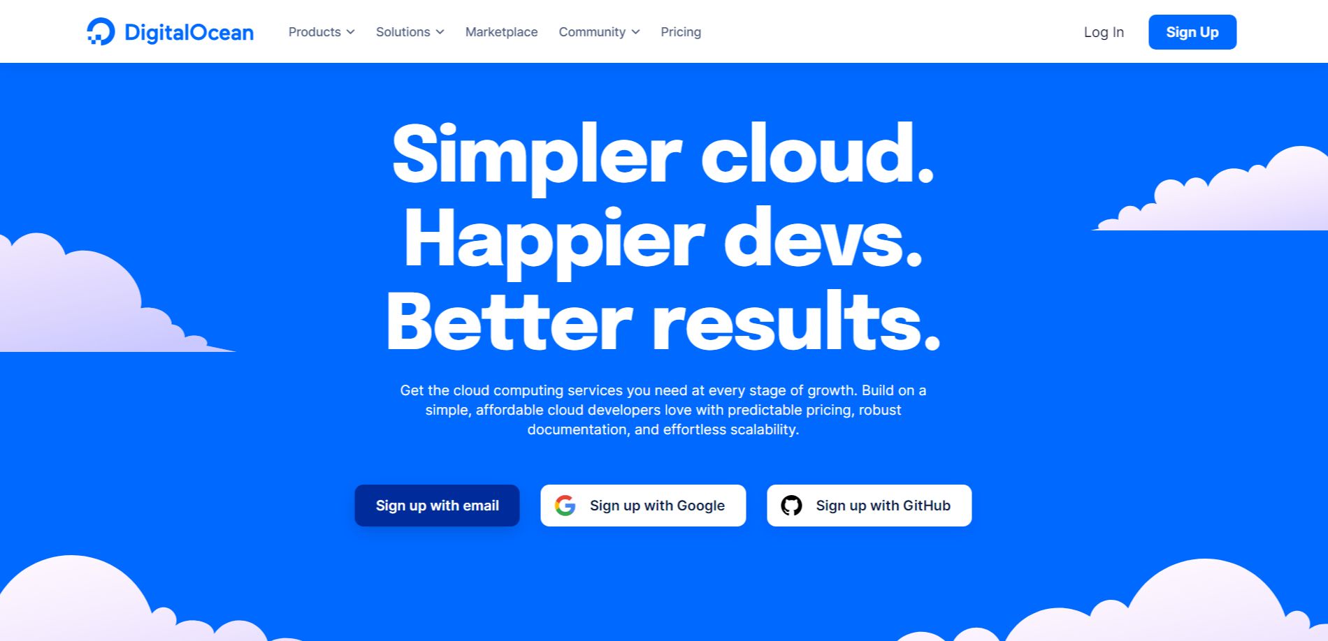
“Simpler cloud. Happier devs. Better results.” is a concise, memorable, and benefit-driven headline. It immediately communicates the core value proposition in a way that resonates with the target audience (developers). The three short phrases create a sense of rhythm and impact.
-
Value Proposition:
The subheadline expands on the headline by explaining how DigitalOcean delivers these benefits: “Get the cloud computing services you need at every stage of growth. Build on a simple, affordable cloud developers love with predictable pricing, robust documentation, and effortless scalability.”
This highlights key aspects:
- Comprehensive cloud services for all growth stages.
- Simplicity and affordability.
- Developer-centric approach.
- Predictable pricing.
- Robust documentation.
- Effortless scalability.
-
Strong Call-to-Action (CTA):
There are three prominent CTAs: “Sign up with email,” “Sign up with Google,” and “Sign up with GitHub.” This streamlined signup process caters to developer preferences and lowers the barrier to entry. Offering multiple options makes it easier for users to get started.
-
Visual Reinforcement:
- Clean and Modern Design: The use of a bold blue background with white text creates a strong visual contrast and a modern, tech-focused aesthetic.
- Cloud Imagery: The subtle cloud graphics at the bottom reinforce the “cloud computing” theme without being overly literal.
-
Strategic Design:
- Color Palette: The blue and white color scheme is professional, trustworthy, and commonly associated with technology companies.
- Typography: The use of clean and readable fonts ensures the information is easily digestible.
- Visual Hierarchy: The headline is the most prominent element, followed by the subheadline and the CTAs, creating a clear visual hierarchy.
-
Focus on the Target Audience:
The language and messaging are clearly targeted at developers. The emphasis on simplicity, affordability, robust documentation, and scalability speaks directly to their needs and priorities.
-
Unique Aspects:
- The three-part headline is concise, memorable, and effectively communicates the key benefits.
- The multiple signup options cater to developer preferences and make the signup process seamless.
- The combination of a strong headline, clear value proposition, and prominent CTAs makes this a highly effective hero section.
- The overall design is clean, modern, and visually appealing to the target audience.