-
Clear and Compelling Headline:
“All-in-one CRM for growing sales teams.” This is a strong, concise, and benefit-driven headline. It immediately communicates the core offering and speaks directly to the needs of the target audience (sales teams). The phrase “all-in-one” suggests a comprehensive solution.
-
Value Proposition:
The subheadline expands on the headline: “Turn more leads into revenue with a high-performance CRM – built for ambitious, remote sales teams.”
This highlights key aspects:
- Lead conversion.
- High performance.
- Suitability for remote teams.
-
Strong Call-to-Action (CTA):
“Start your 14-day free trial” is a clear, prominent, and action-oriented CTA. It encourages immediate engagement and lowers the barrier to entry by offering a free trial. The “Watch an on-demand demo” link serves as a secondary CTA for users who want to learn more before trying the product.
-
Visual Reinforcement:
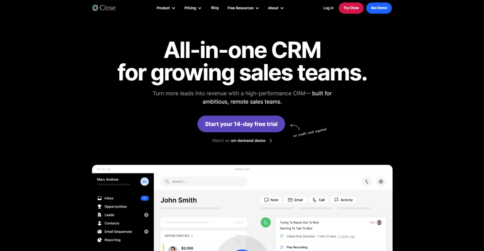
- Screenshot of the CRM Interface: The prominent screenshot of the Close CRM interface provides a concrete example of the product in action and visually reinforces the “all-in-one” aspect of the headline. The interface shown suggests various features, including contact management, email, call tracking, and opportunity management.
- Dark Mode Design: The use of a dark background is visually striking and gives the product a modern, sophisticated feel. It also helps the interface screenshot stand out.
-
Strategic Design:
- Color Palette: The dark background with white text and purple accents creates a modern and professional aesthetic. The purple is used strategically for the CTA and other interactive elements.
- Typography: The use of clear and readable fonts ensures the information is easily digestible.
- Visual Hierarchy: The headline is the most prominent element, followed by the screenshot, the subheadline, and the CTA, creating a clear visual hierarchy.
-
Focus on the Target Audience:
The language and messaging are clearly targeted at sales teams, particularly those who are ambitious and working remotely.
-
Unique Aspects:
- The combination of a strong headline, clear value proposition, and prominent CTA makes this a highly effective hero section.
- The screenshot of the CRM interface provides a concrete visualization of the product and its capabilities.
- The emphasis on remote teams is particularly relevant in today’s work environment.
- The “No credit card required” reassurance removes potential hesitation and encourages sign-ups.