-
Clear and Compelling Headline:
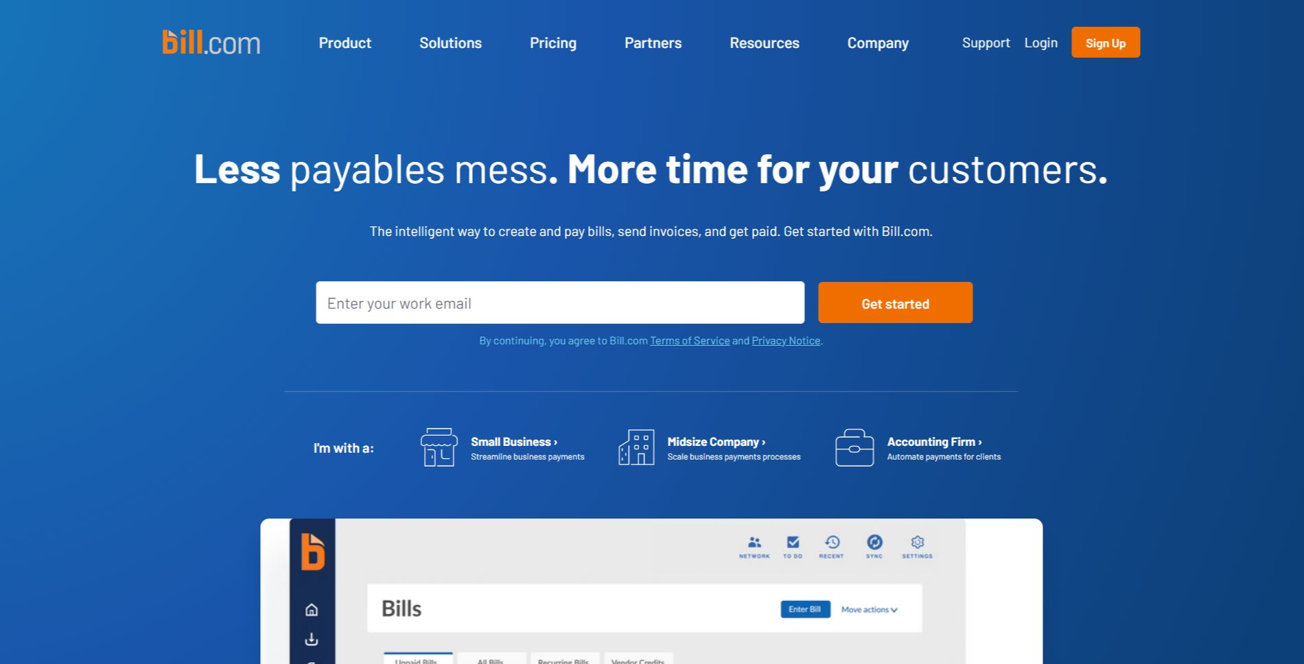
“Less payables mess. More time for your customers.” This is a strong, concise, and benefit-driven headline. It immediately communicates the core value proposition and speaks directly to the pain points of the target audience (businesses dealing with accounts payable). It’s memorable and easy to understand.
-
Value Proposition:
The text below the headline expands on the value proposition: “The intelligent way to create and pay bills, send invoices, and get paid. Get started with Bill.com.”
This highlights key aspects:
- Intelligence and automation.
- Comprehensive suite of tools for accounts payable and receivable.
- Focus on efficiency and time savings.
-
Strong Call-to-Action (CTA):
“Get started” is a clear, prominent, and action-oriented CTA. The email input field combined with the CTA streamlines the signup process. “Sign Up” in the navigation bar also serves as a secondary CTA.
-
Visual Reinforcement:
- Screenshot of the Platform: The prominent screenshot of the Bill.com platform provides a concrete example of the product in action and visually reinforces the “intelligent way” aspect of the value proposition. The interface shown suggests various features, including bill management, payment processing, and reporting.
-
Strategic Design:
- Color Palette: The use of a clean white background with blue accents creates a professional and trustworthy feel. The blue is consistent with Bill.com’s branding.
- Typography: The use of clear and readable fonts ensures the information is easily digestible.
- Visual Hierarchy: The headline is the most prominent element, followed by the screenshot, the value proposition text, and the CTA, creating a clear visual hierarchy.
-
Focus on the Target Audience:
The language and messaging are clearly targeted at businesses of all sizes, with specific sections for small businesses, midsize companies, and accounting firms. The emphasis on streamlining payments, automating processes, and saving time resonates with their needs and priorities.
-
Unique Aspects:
- The combination of a strong headline, clear value proposition, and prominent CTA makes this a highly effective hero section.
- The streamlined signup process with the email input field directly in the hero section makes it easy for users to take the next step.
- The segmentation into “Small Business,” “Midsize Company,” and “Accounting Firm” options allows users to quickly find the relevant information and solutions for their specific needs.
- The “Bills” graphic at the bottom further reinforces the focus on accounts payable and provides a visual representation of the product’s functionality.