-
Clear and Compelling Headline:
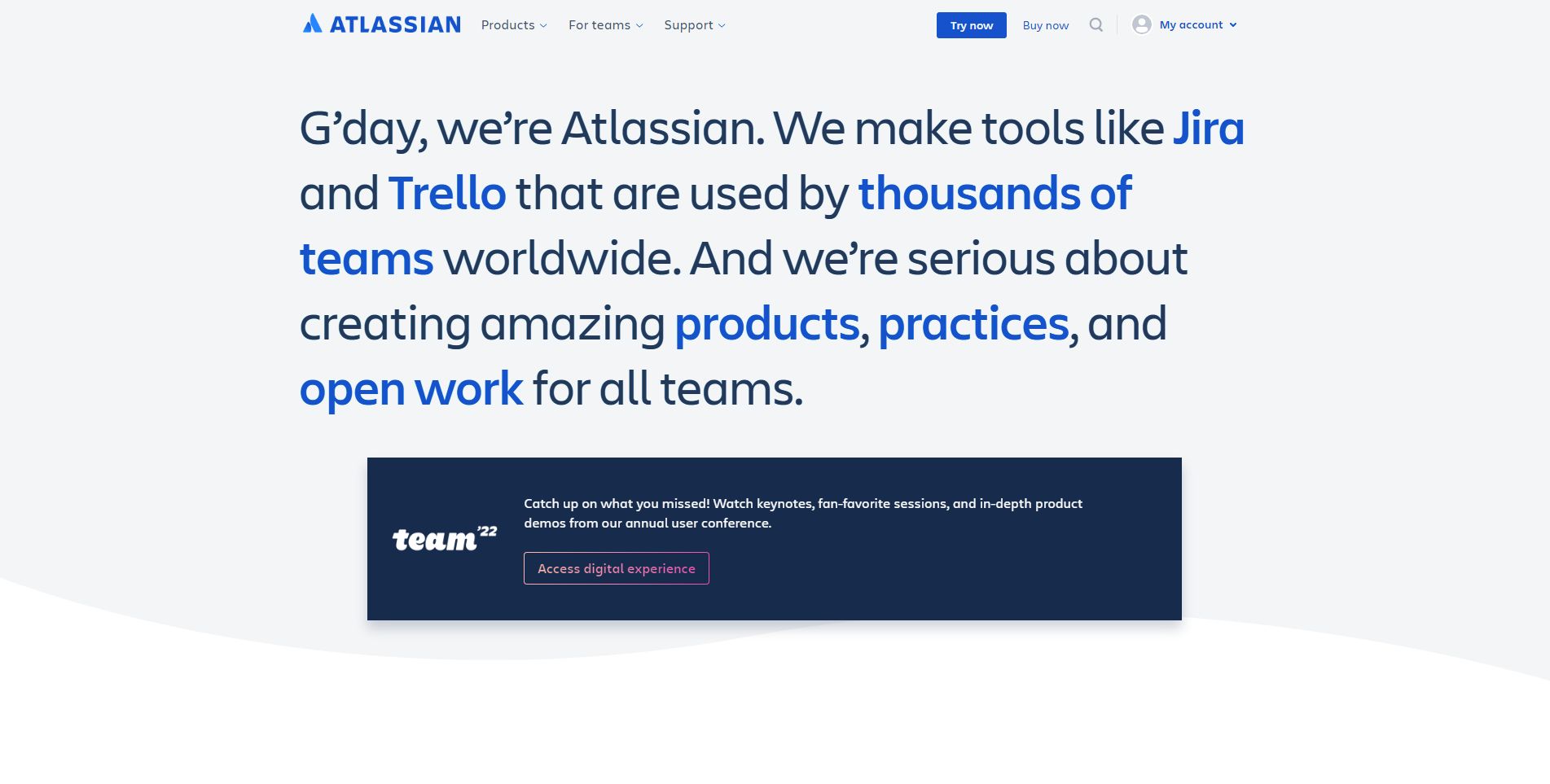
While there isn’t a traditional headline, the opening phrase “G’day, we’re Atlassian” serves as an introduction and establishes a friendly and approachable tone. It’s concise and memorable.
-
Value Proposition:
The text clearly communicates Atlassian’s core offering and values: “We make tools like Jira and Trello that are used by thousands of teams worldwide. And we’re serious about creating amazing products, practices, and open work for all teams.”
This highlights key aspects:
- Popular and widely adopted tools (Jira and Trello).
- Focus on creating amazing products.
- Emphasis on best practices and open work.
- Targeting all types of teams.
-
Strong Call-to-Action (CTA):
“Access digital experience” is a clear, prominent, and action-oriented CTA. It encourages immediate engagement and focuses on exploring the content from their user conference.
-
Visual Reinforcement:
- “team ’22” Logo: The prominent display of the “team ’22” logo visually connects the hero section to their annual user conference. The logo is recognizable and suggests a focus on community and collaboration.
- Clean and Simple Design: The overall design is clean, uncluttered, and professional. The use of white space and clear typography makes the information easy to digest.
-
Strategic Design:
- Color Palette: The blue and white color scheme is consistent with Atlassian’s branding and creates a professional and trustworthy feel.
- Typography: The use of clear and readable fonts ensures the information is easily digestible.
- Visual Hierarchy: The introductory phrase and value proposition text are the most prominent elements, followed by the “team ’22” logo and the CTA, creating a clear visual hierarchy.
-
Focus on the Target Audience:
The language and messaging are clearly targeted at teams of all kinds, emphasizing collaboration, productivity, and open communication.
-
Unique Aspects:
- The friendly and informal tone (“G’day”) helps create a welcoming and approachable impression.
- The emphasis on “open work” highlights Atlassian’s commitment to transparency and collaboration.
- The focus on their user conference content (keynotes, sessions, demos) provides valuable and relevant information to their audience.
- The “Try now” and “Buy now” buttons in the navigation bar offer additional engagement opportunities.