Hire a Design, Dev & Marketing
Team on Subscription


Best Unlimited
Graphic Design
Subscription Service

Trusted by 1200+ Startup, Brands, Agencies
 4.8 out of 5 stars


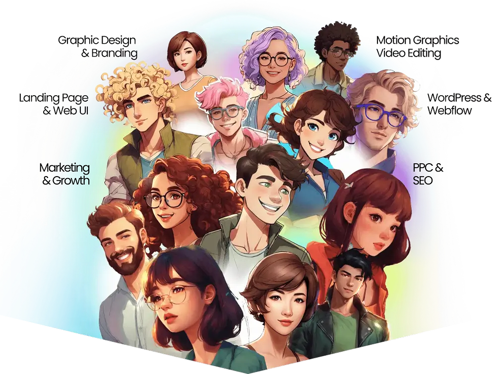
Your own personal team of Creatives, Developers & Marketers
Get a full-stack team on subscription that takes care of everything for you.




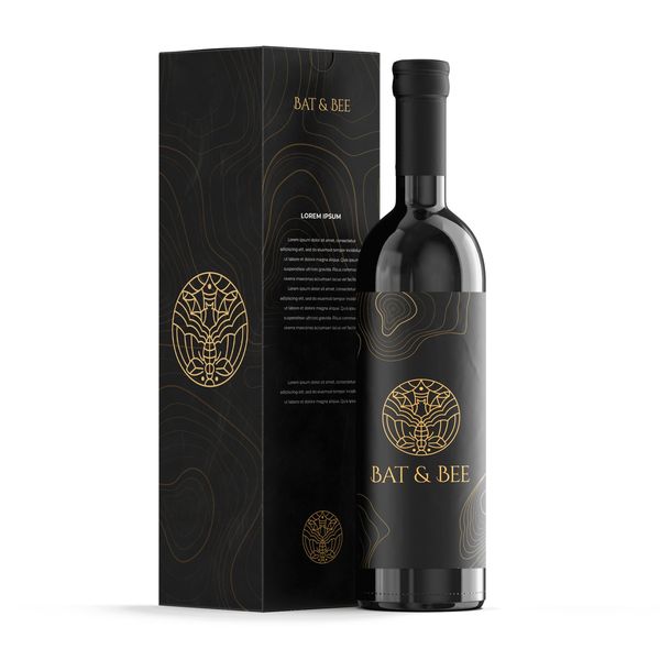
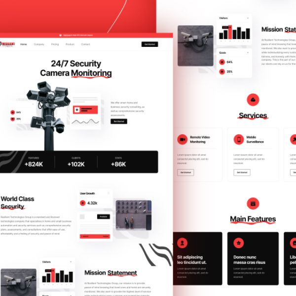


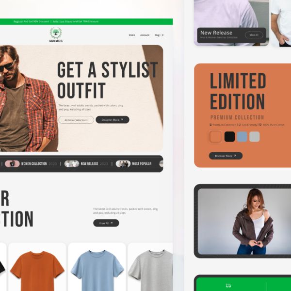
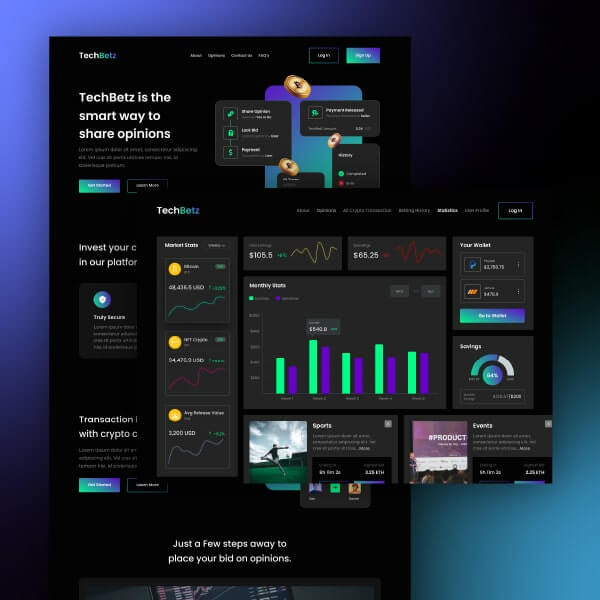


Any Task. All Tasks.
One Flat Fee.Any Task. All Tasks. One Flat Fee.
Request Any Task & We get it done for you.

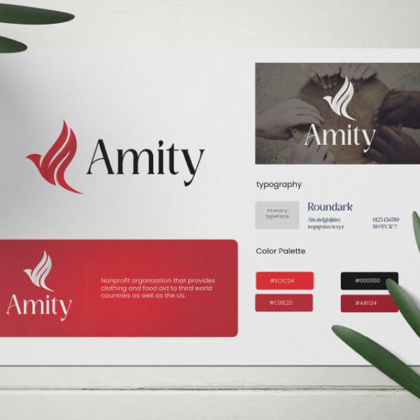
Branding & Logo

Human Illustration

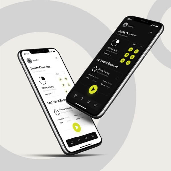
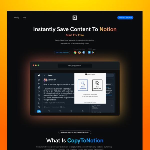
Web UI

Mobile App UI

Artworks

T-shirt Design

Stationery

E-Book & Cover

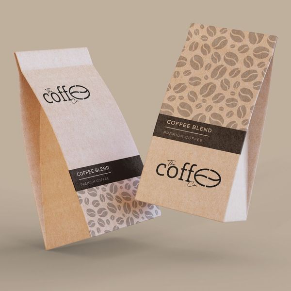
Packaging

Banner Ad

Infographic

Social Media

Pitchdeck

Flyer & Poster

Brochure

Newsletter
Icon Pack

Podcast Cover

Mascot

Photo Retouching

Explainer Videos

Logo Animation

Typography Videos

Gif Animations

E- Learning Videos

Character Animation

Testimonial Videos

Video Editing

UI Animation

Tutorial Videos

Text Overlays

Reels & Videos

WordPress

Beaver Builder

WooCommerce

Unbounce

Visual Composer

Oxygen Builder

Divi Builder

WP Bakery

Elementor

Webflow

WiX Classic

React JS

Clickfunnels

Go High Level

WiX Studio

Shopify
UnlimitedIllustrations
for Flat Monthly Fee
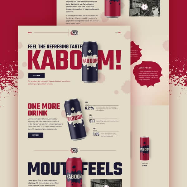
Killer Landing Page Website, Dashboard & App UI Designs Done for you.
We help you create UI designs that your users would love & landing pages that convert.
 VIEW
VIEW


Killer Landing Page Website, Dashboard & App UI Designs Done for you.
We help you create UI designs that your users would love & landing pages that convert.
 VIEW
VIEW

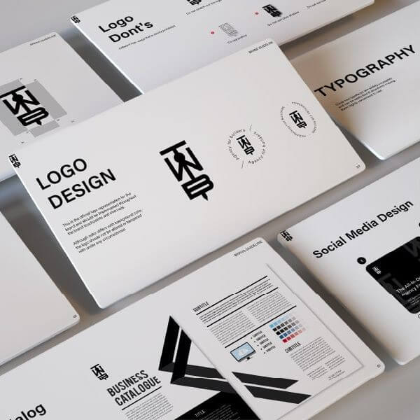
Custom Stunning Logo Designs & Complete Branding.
Our team can do complete logo & brand identity design for you.
 See Samples
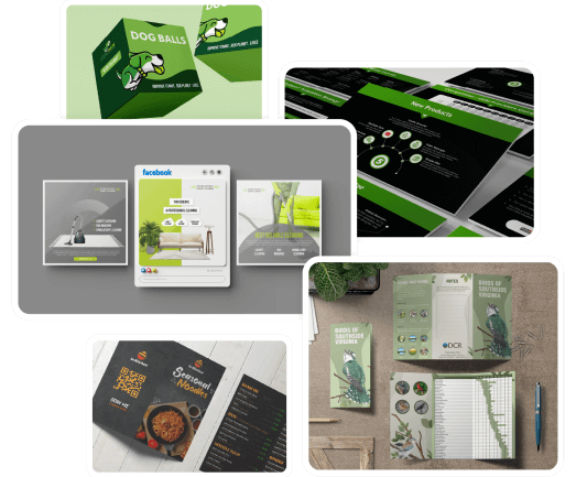
You can Request All Types of Graphic Design Tasks.
From Simple to Complex Graphic Design tasks all done for you.
 VIEW
VIEW

All Type of Illustration Hand Crafted for your brand.
Discover the power of visual storytelling through our Illustrations.
 See Samples

Fast & Optimized Websites in All Popular Softwares Made for you.
We specialize in WordPress, Webflow & React JS development to make your website shine.
 VIEW
VIEW
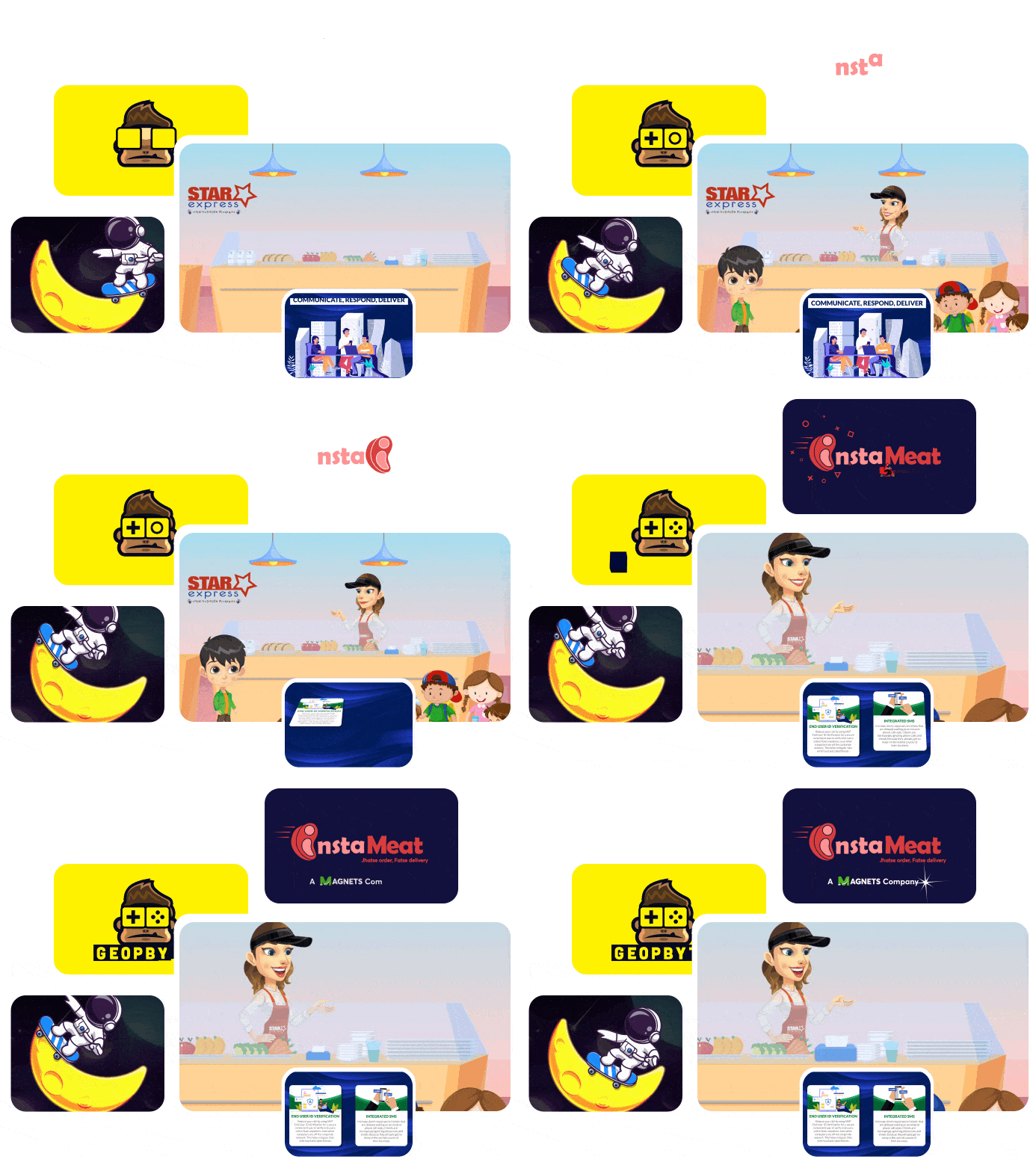
Request Motion Graphics Simple Animation & Video Editing Tasks.
Experience Motion Graphics & Video that make a lasting mark.
 VIEW
VIEW

PPC Ads
& SEO

Outreach
& PR

Growth Marketing

Copy & Content Writing

Email & Lifecycle Marketing

Product Launch Campaigns
We Design & Execute Marketing that Grows Revenue.
Get your dedicated team focused on one thing: executing marketing that compounds into revenue.
 VIEW
VIEW
Send Any Task
Request to your
Team
design / dev / marketing team.Use our Dashboard to Send Tasks & Collaborate
with your team.
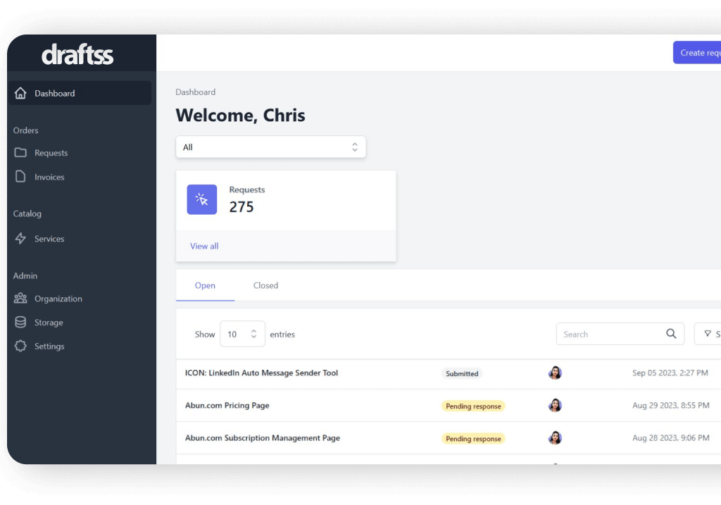
You can collaborate anywhere
with your team.
Every feature you need.
All Benefits across All Plans.
One Subscription gets you:
- - Graphic Designers
- - Logo Designers
- - UI & Landing Page Designers
- - Motion Graphics Artists
- - Video Editors
- - WordPress Developers
- - Webflow Developers
- - Shopify Developers
- - HTML Developers
- - React Developers
- - Cold Email Experts
- - Social Media Manager
- - Content Writers
- - PPC & Ad Experts.
- - SEO Manager
- - Copy Writers
- - GTM Experts
Unlimited Designs
Unlimited Revisions
Unlimited Brands
135+ Services Offered
Unlimited Users
Daily Output
Speedy Task Outputs
24/7 Support
No Contracts
All in One Solution
Project Manager
Own 100% Copyright
No Hidden Cost or
Fees
NDA for your
Projects
Premium Stock Images
Cancel/Pause Subscriptions
Experienced
Designers
Task Management Dashboard
Any CRM / App
Integration
Zoom/Meet Call Collaboration
White Label for
Agencies
Slack Collaboration
6 days a week
Talk to Team
Start your 7 day Free Trial
2 mins Setup. No Contracts. Cancel Anytime.
Graphics
- Graphic Design
- Illustrations
- Web & App UI Design
- Motion Graphics
- Video Editing
- Website Development
- Copy & Content Writing
- PPC Ads & SEO
- Outreach & PR
- Growth Marketing
Experience
- Graphic Design
- Illustrations
- Web & App UI Design
- Motion Graphics
- Video Editing
- Website Development
- Copy & Content Writing
- PPC Ads & SEO
- Outreach & PR
- Growth Marketing
Build
- Graphic Design
- Illustrations
- Web & App UI Design
- Motion Graphics
- Video Editing
- Website Development
- Copy & Content Writing
- PPC Ads & SEO
- Outreach & PR
- Growth Marketing
Here is what our customers say...

Tony Lewis

Lisa Gibbons

Kelebogile Moeketsi

Derek zklink.org

Amresse farrow from Logical Leap

Niccolò Ruggieri from niccoloruggieri.dev

Ebrahem Shabaan Co-Founder, Rugged Beard Co

Vanessa Gilbert – Terradepth

Luke Iles – Handlagency

A design team that feels like a partner
Draftss doesn’t just deliver files. They share reasoning behind choices & even send explainer videos. I genuinely feel they care about my business.
Sarah K.

From skeptic to loyal client
At first I wasn’t sure they could keep up, but their speed & quality surprised me. Even when a week was slow, they made up for it. My PM was always proactive & made sure I was happy.
Lucas M.

Professional & detail-oriented every single time
Draftss gives me multiple variations & double-checks details before sending. My PM cares deeply about getting things right & that makes all the difference
Priya R.

Better value than KIMP by a mile
I tried KIMP before & noticed quality dropping. With Draftss, I get far more value. Some days they’ve delivered entire web pages or complex animations that left me speechless. At $20/day it’s unmatched.
Eugenia O.

Fast video design that fits any style
They adapted quickly to whatever I needed & delivered strong results without delays. Communication was smooth & easy throughout.
Monica S.

A team that scales with you
We started with monthly & quickly moved to annual because they kept pace with our growing requests.They deliver with consistency & speed.
Daniel P.

Sleek, modern & on point
Draftss delivered clean UI & branding work that impressed me. When I asked for faster updates, they reassigned me a new PM who was much more responsive. That quick fix made all the difference.
Kevin S.

Blown away by agency-level designs
Everything Draftss made looked like it came from a top agency. The best part? The price is a fraction of what I’ve paid before. They nailed our brand style instantly.
Alisha V.

Better than Design Pickle
I’ve used Design Pickle, but Draftss produced better designs with fewer revisions. Communication was smoother & the experience overall was much better.
Tom H.

Cleared my backlog in weeks
I had months of pending projects. Draftss got through them quickly. Their dashboard is easy to use & the team kept improving as we worked together.
Emily G.

Absolutely top-notch
Every project has been handled with care. They’re consistent, reliable & professional. I’d recommend them in a heartbeat.
Ryan C.

Designs that rarely need revisions
Most drafts were perfect on the first attempt. That saved me time compared to endless back-and-forth with freelancers.
Sofia T.

More than just files
I’ve tried Penji & others, but Draftss stands out. They explain their design logic & sometimes send video breakdowns. That extra effort makes me feel valued.
Noah F.

Consistently exceeded expectations
I’d send rough ideas & they’d turn them into something far more creative. My PM responded fast & the designs were always impressive.
Aisha M.

Even my tough standards were met
I’ve worked with many agencies & expected to be disappointed. Draftss matched my demanding requirements with speed, communication & great design quality.
Jason B.

Efficient & creative
Draftss quickly turned my ideas into polished results. Their creativity shows in every project.
Maria N.

Our Go-To Partner for Design Growth
Over the past month, Draftss has been helping us rebrand & launch a whole new marketing division, and the experience has been fantastic. Our project manager kept everything on track, communication was smooth, and problems were solved almost instantly. The efficiency, creativity & attention to detail really stood out, and it feels like we’ve gained an extended design team that’s fully invested in our success. I’m genuinely excited to continue this process together.
Oliver J.

A team that listens
They always confirm details before starting & provide options. That makes the process simple & stress-free.
Chloe W.

Outstanding graphics & motion work
Draftss has never missed a beat. My PM has been supportive since day one & the results have been consistently impressive.
Liam D.

Reliable designs with a stellar PM
The quality is always strong across my B2B & B2C projects. My PM understands briefs quickly & gets things right with minimal revisions.
Grace P.
Frequently Asked Questions
What is Draftss? Who uses your service?
Everybody who requires Graphic Designs, UI Designs, Videos or Frontend Development can use our service. But it is majorly used by Agencies, Startups, Brands & Enterprises.
What kind of tasks do you do?
On the development side, our Build Plan covers frontend development.
We work with:
Core Tech: HTML, CSS, JavaScript
Frameworks: React.js, Tailwind CSS, Bootstrap
WordPress Builders: Elementor, Divi, Beaver Builder
E-commerce: Shopify, WooCommerce
No-Code / Low-Code: Webflow, Wix, Unbounce, GoHighLevel, ClickFunnels
We focus on delivering responsive, high-quality & conversion-optimized interfaces, no matter the platform.
I love speed, what is the quickest turnaround time?
What happens after I’ve subscribed? / How does the process after subscription work?
How do I submit and manage my requests?
How many requests can I submit at a time?
How do revisions work? & how many revisions do I get?
What are your charges for White Labeling?
What kind of design requests you do not work on?
Do I have to sign a contract?
When & how can I cancel?
If you’re on the 7-day free trial and don’t want to be charged, make sure to cancel at least 24 hours before it ends (that’s Day 6).
For existing subscribers, cancel at least 24 hours before your renewal date to avoid being charged for the next cycle.
To cancel, just log in to your dashboard, go to the “Services” section, and cancel your active subscription. Quick and easy.
Who has ownership of the designs and codes?

