Have you ever noticed that how certain Graphic Designs attract you more? How some designs look classier than others? It’s not just you. Designs have the ability to attract as well as repel. It is up to the designer how classy or bland the designs are going to be.
Graphic Designs are used worldwide for various purposes. It is made for art’s sake, for digital illustrations to promote different products and services, for any logo creation, web designing and so forth. However, a classy design will enable you to hold the viewer’s attention more.
In case you are a designer trying to make classier designs, here are some tips for you:
Pay attention to your structural framework
The structure of your design is something you need to pay attention to first. You may use software applications that have automatic smoothing of edges in case you are a beginner.
While creating a logo, keep in mind two things:
• It should be easy to remember even for the layman.
• It should be a projection of the company’s agenda.
Of course, don’t forget to trademark your logo, or some random person can reproduce it illegally!
The structure of any website needs to have some basic forms that are eye-catching, and engages the readers at the same time. You can have a header with your company logo at the top. Sufficient images relevant to your content or products are also recommended.

Typography
Oftentimes, graphic designs combine typography to create a more distinguished and unique outlook. Some designers would go to the length of saying that 95% of your design is dependent on the style of your topography.
However, that does not mean that you use a lot of different styles to create an effect! In fact, it is minimalism in graphic design that is considered classier.
It is advisable to use maximum three basic types of font, on which you may add coloring or depth to make it look better.
While selecting a font, it is recommendable that it:
- Is aesthetically pleasing to the eyes.
- Should complement the design, and doesn’t appear abrupt.
- Can be read easily. For this purpose you might use a font which is leaves some room around each alphabet.
Use color Strategically
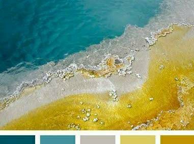
Graphic design gives you the opportunity of using a wide range of colors as well as patterns. Use them wisely!
You will find that different shades can evoke different emotions from the viewers. Just like the typography, make sure that you position the colors in a proper manner.
For websites, it is advisable that you use two to three colors and not more than that.
Sometimes, using contrasting colors can help you to balance the scheme and make the effect classier. However, inappropriate usage of colors can make your designs look chaotic and unpleasant.

Use subtlety
Your designs are a reflection of your ideas or agendas. In case you are drawing for any company, you need to keep in mind their agendas as well.
Classy designs require some amount of subtlety in your digital illustrations. You can’t be too loud with your colors or textures. In fact, try not to incorporate too many shades or textures randomly. Your design needs to have an organization and have a neat appearance.

Learn from the best
One of the best methods to learn is to look up at the works of different digital artists or professional designers. You may find them online by searching for them.
Taking ideas from other designs does not mean that you copy them mindlessly. It is done so that you can get an idea about what works best with which colors or textures. You are always welcome to experiment on your own!
Draftss is well known for providing graphic design services to entrepreneurs. They have schemes such as unlimited graphic design packages to help struggling and small businesses, including startups. It will be worthwhile to check out their blog for inspiration and ideas.
Other than designs, they also provide useful tips regarding planning and strategy with respect to both: business booming and graphic designing techniques. For an aspiring designer, it is definitely the website you should visit!
