


Startups have been a sign of being innovative, tech-freaky & customer-friendly services. These messages must be provided by your website as well to get SEO, a Low Bounce Rate & Better Retention Rate.
So if you are looking to set up or update your website design for the startup, then this article will provide you with that can help your website to stand out in performance.
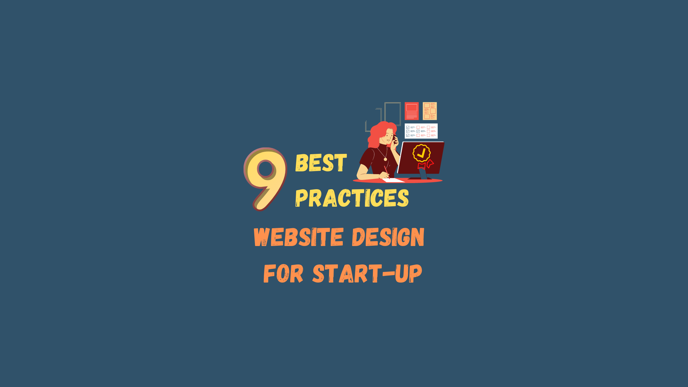
9 Best Practices in Website Design for Startups
—————–
- Design for Specific Brand Image
- Intriguing Hero Section
- Restrain with Minimal design
- Adaptive Responsive Design
- User-Friendly Navigation
- Attractive Visual Elements
- Clear Readability
- Conversation based Copy
- Provide Portfolios & Social Proof
—————–
1. Design for Specific Brand Image
Your web design develops a huge impression that people perceive your start-up & also the quality of the product. Having an established brand requires maintaining that brand image as that helps in building trust with visitors.
There are different aspects to creating a brand image like colors, fonts & images. You can refer to color palette designs from Draftss that can help in understanding & taking decisions regarding what color can describe your brand better.
Make sure that your designs are not overcrowded with elements as it can distract users from your content & reduce their chances of conversion.
You should also make sure that your design is consistent throughout your site. This will provide a cohesive feel and provide users with a positive experience.
Apart from this, you can enhance your website’s look by depending on your company’s brand & audience. It can consider containing eye-catching photos & videos.
Your design can shape how visitors interact on your website & what actions they take, it’s significant to have those activities in mind as you work out the details of each page.
2. Intriguing Hero Section
Next idea of Design for Startup, Hero Section needs to be visually appealing & targeted to deliver the core message & branding of your startup.
It takes less than 50 milliseconds for a user to form an opinion about a site & more than 75% of users admit to judging a company’s credibility solely on its site design. Hero sections are responsible for getting all of this done in a split second.
Generally, they feature a headline with subtext, a button that calls the visitor to action & appealing photography or design that adds visual interest but doesn’t overwhelm them.
For startups, the hero section should simply, quickly & concisely differentiate your brand & easily describe your technology’s value.
Most startups are joining a crowded market. By now, users have a working ability to digest and understand how tech businesses enter and innovate in their industry.
When communicating your business in the hero, it’s no use exposing all the ways your company will disrupt and innovate. Your user probably assumes you already do that. Use the space, instead, to differentiate your brand & showcase your product.
3. Restrain with Minimal Design
Startups are known for their big ideas and well-conceived tech to solve complex problems.
It’d be easy for a startup’s website to run away with these ideas and congest its site with boundless pages and explosive design. But startups and their technology almost always prize ease for the consumer, too, and a startup’s website should reflect this.
When designing a startup website, keep it simple. Have restraint, and pare down your design.
The bigger your company’s idea, the more important, clear, concise, and intelligent minimalism will be to showcasing your product and establishing an uncluttered identity for your brand.
Your website’s design should be clean and unburdened, and your site structure — the organization, number & type of your website’s pages — should be as navigable as possible.
In general, good web design should strive for a flat hierarchy, meaning that users can access all the information on your website in 2-3 clicks. Regardless of your website’s needs, content is always more discoverable when it’s not buried under multiple pages, and finding a balanced way to structure your site’s content without overwhelming your user is essential.
This is particularly true for startups, who may have to dedicate more space to describe their product and its uses than other companies. Just because your startup’s product is complex, however, doesn’t mean your website should be.
4. Adaptive Responsive Design
People are going to access your website design for startups from multiple types of devices, including desktop and laptop computers, tablets, and smartphones. You need to make sure that all of them can access & navigate your pages — And, the best way to do this is with responsive design.
Responsive design ensures that your website adjusts to the browsers and screen sizes your visitors use. Whether someone accesses your website on a smartphone or desktop computer, the browsing experience will be the same.
So, why is this important?
When you think about how you navigate a site, there are often small buttons and links that are scaled to be used on a desktop computer. If you shrink that size down to fit a mobile phone, those links and buttons can become difficult to use. With responsive design, this isn’t an issue, since the site will adapt to be usable on any device.
It’s also important because today, users spend more time browsing on mobile devices than they do on desktop computers. This means that a site that only caters to desktop users provides a poor experience for a huge chunk of your potential customers.
With responsive design, you can be sure that you’re providing a great experience for all of your visitors. This can lead them to spend more time on your site, increasing the number of pages they visit, as well as the chances of them converting.
5. User-Friendly Navigation
Users need to be able to quickly and easily find the information they want on your site. If they can’t access the details they need to make an informed decision, they’re unlikely to convert.
This means that your navigation can be a major factor in your success, and it should be as simple and organized as possible. In most cases, this means creating a horizontal navigation bar across the top of the page with straightforward categories.
Your navigation should have simple headings divided up by product type, services, locations, or another logical category type that makes sense for your business. You can use dropdown menus below those headings with more categories if necessary.
Make sure that your categories are logically organized in a way that makes it easy for users to determine which one has the information they need. Think like your audience, and consider how what you’d look for if you wanted information on a specific product or service.
You can also add helpful links to your footer. When people scroll to the bottom of a page, they should be able to consider browsing. This prevents them from having to scroll up and down to find information.
Your navigation plays a crucial part in keeping users on your site & can help users find the information they want and stay engaged with your content.
6. Attractive Visual Elements
Visual elements add a lot to your web design for a startup. They’re the eye-catching details that keep users engaged, and pages with graphics and photos are much more interesting to browse than those with only text.
One of the easiest ways to add visual interest to your site is by incorporating relevant photos and graphics throughout your written content. These immediately draw users’ eyes and make them more likely to keep scrolling through your pages.
When you choose photos, it’s essential that they’re relevant to the content and your brand. It’s best to avoid using stock photos if possible, as they can often come across as generic, but they can work for illustrating a point in a pinch.
The better option, though, is to use photos of your staff, your work, and your products. This will give your visitors an authentic feel for your business. You can also work with a designer to create custom graphics or infographics as another way to incorporate interesting visuals.
If you have the budget, videos are one of the most effective forms of visual content. Adding one to a page can improve conversions by 86%. This makes them a great addition to improving your website’s performance, engaging visitors, and increasing the time potential customers spend with your content.
In fact, you are 53 times more likely to end up on the first page of Google results if you utilize video on your site. This is because people tend to remain on sites longer to watch videos than they do to read the content.
7. Clear Readability
One often-overlooked element in web design is readability. You might have a ton of great information on your site, but if visitors have trouble reading it, it won’t help you reach your marketing goals.
It is absolutely essential for people to be able to easily read the information on your website. The first step is simply to make sure that there is plenty of contrast between your text and background colors. This will make your text stand out and be easy to scan.
Another important part of readability is font. Your font selection has a major impact on how easy it is to read and skim your content, so it’s important to use a clean one that is easy to read.
While it can be tempting to choose fun fonts, they’re often difficult to read. Stick to simple fonts for your body copy, and limit the fancy ones to your titles or headings.
Even so, it’s best to stick to 2-3 different fonts. If you use too many different fonts, your website can look cluttered and unappealing. By sticking to a small selection, you can create a clean, cohesive feel.
You should also ensure that each font is big enough to read wherever you use it. If a font is too small, you’ll drive users away.
Your readability can dramatically impact how users experience your website. It’s an easy element to fix, too — so if your site is difficult to read, a few quick adjustments could make a huge difference.
8. Conversation-based Copy & FAQ
There’s a good chance that your startup offers a new product or service in an established industry—or has created a product or technology that innovates a customer experience or company’s workflow.
If so, that means your customer is likely to have many questions about using and adopting your product. It’s integral, therefore, that your startup website provides enough exposition, content & information about your company to adequately address your customers’ questions.
It’s not a bad idea to consider providing additional information about your company and product in the form of a frequently asked questions (FAQs) page on your startup website. In fact, 60% of consumers say that their go-to channel for simple inquiries is a digital self-service tool, like a FAQ page.
A FAQ page can take many forms, from a traditional questions page to homepage features, support guides, how-to articles & chatbots. What’s important is that your FAQs page:
- Provides helpful content for users and addresses their hesitations.
- Answers the right questions for your target audience and lead generation goals.
- Improves the user experience (UX) for your customer with appealing design & layout.
9. Provide Portfolios & Social Proof
Assuring your audience that your product, service & company is trusted & reliable is essential, particularly for new and trailblazing startups.
In web design, trust-building content refers to a wide umbrella of social proof, like client testimonials, product reviews, partner logos, professional associations & awards. Including these features in your startup website should be a central consideration.
92% of consumers read online reviews and testimonials when considering a purchase. 88% trust online reviews as much as personal recommendations & 72% say positive reviews and testimonials make them trust a business more.
Including social proof or trust-building content on your startup’s website can make or break whether you’re able to convert site visitors into customers.
Testimonials and social proof can take many different forms.
Most new entrepreneurial ventures and innovative consumer technologies receive a lot of press attention. Including logos of the publications that have featured your company and, if effective, a pull quote from an article that shows notoriety and relevance.
We at Draftss provide a Dedicated Team for Unlimited Graphic Design & Web UI Services on a Super Affordable Monthly Subscription, all of this Fast & Easy with our Top Talent & Streamlined Productized Process.
a
Amin Memon Drop your thoughts in the comments below.
Your email address will not be published. Required fields are marked *