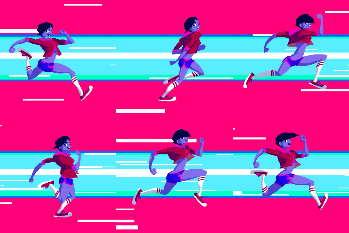
To effectively communicate ideas and engage audiences, motion graphic designers combine animations, graphic designs, and sounds to breathe life into their storytelling. This blend of elements creates compelling motion graphics that brands use to capture attention and communicate their message effectively.
Designing is more than just creativity; it’s an art form guided by the principles of motion design. In this article, we’ll explore 10 fundamental principles of motion design that every designer should master to create meaningful visuals.
10 Key Principles of Motion Design

If you are a motion graphic designer, understand these 10 principles of motion design to better your art.
1. Timing
Timing is the backbone of motion design. It defines how long an action takes and influences the rhythm and flow of the animation. Good timing can convey emotions, whether it’s urgency with snappy movements or calmness with slower, fluid transitions.
2. Easing
Easing is one of the most fundamental principles of motion design. It mimics the way objects behave in the real world, making animations feel natural. For example, when you throw a ball, it does not instantly stop at a place but gradually rests in motion. Applying easing to motion design helps create smooth transitions, making movements appear fluid rather than mechanical.
3. Offset & Delay
When multiple UI elements move simultaneously, it can overwhelm users, making it hard for them to process the individual importance of each element. Offset and delay introduce subtle staggered movements, creating a clear hierarchy and guiding the user’s attention. This highly interactive technique simply signals to users that multiple options exist & not just what they see first.
4. Mass & Weight
In motion design, maintaining a sense of realism is key. Objects of varying sizes and weights behave differently. A bouncing ball moves lightly and energetically, while a rolling boulder moves slowly with greater momentum. By considering an object’s mass and weight, designers can infuse animations with believable physics, making the scenes more immersive and relatable. For instance, heavier objects should take longer to accelerate or decelerate than lighter ones.
5. Anticipation & Arcs
Anticipation is a movement that occurs to prepare the audience for the main action. Suppose you want to show that a person is jumping. In that case, you must first create anticipation by making that person bend down and follow the natural movement of jumping. This makes your motion graphics more realistic & not too sudden or fake.
This is where Arc comes in. In nature, movements rarely occur in straight lines. The principle of arcs ensures that animations follow natural trajectories, adding fluidity and realism. Whether it’s the swing of a pendulum or the flight of an arrow, arcs bring a sense of rhythm and life to motion designs. For example, when animating a ball being thrown, it should follow a curved path instead of a straight one. Applying arcs effectively can elevate the quality of your designs, making them feel intuitive and harmonious.
Typically for an action to happen, the object or a person must move in the opposite direction. For a catapult to work, it first has to be stretched all the way back & then launched. The same principle applies to motion design.
6. Squash & Stretch
The squash & stretch technique portrays your object as having weight, flexibility, speed, & motion. For example, suppose you are animating a bouncing ball. In that case, you must make it look natural by not keeping the ball round without changing its shape the whole time. To make it appear realistic, you can make the ball look squashed when it hits the floor & stretches sideways. Then again, it gets back in a round shape as it bounces off the floor.
This principle is essential for conveying weight and energy. Beyond just animation, squash and stretch can also apply to UI elements, such as buttons, to make interactions feel responsive and engaging.
7. Staging
Staging is a principle of motion graphics design that draws focus to a certain part of the scene while minimizing the attention to others. Objects closest or highlighted will capture more attention, making it completely clear for the audience to focus upon. For instance, a bold animation on the primary call-to-action button draws attention, while secondary elements fade into the background. Balancing the white space is also a crucial aspect to consider.
You can add a smaller secondary animation to your main object to highlight it.
8. Overlay
Overlay, as the name suggests, layering or stacking elements. It enables elements to be concealed & shown based on user demands by imitating depth. It enables us to stack layers on top of one another, modifying the value of both. For example, a pop-up modal appearing on top of a dimmed background emphasizes its importance while maintaining context. The layered design makes the space more structured, conveys depth, & is easier for people to understand.
Learn how to create Stunning Overlay Motion Graphics with 7 Easy Steps.
9. Cloning
In motion graphics design, when UI elements split up into different elements, it is called cloning. Basically, with this technique, you can create new objects from existing ones. It’s one of the most effective ways to highlight important information or interaction options.
This principle is particularly useful in UI/UX design, where designers often need to replicate components for interactive elements like dropdown menus, grids, or patterns. Cloning can emphasize specific interactions, such as splitting one card into multiple options or creating ripple effects. This technique enhances user engagement by breaking monotony and guiding focus effectively.
10. Appeal
Appeal is one of the most important principles of motion design that every designer should consider. After all, it’s all about how appealing your design looks that will captivate your users. A great way to do that is by arranging your scene in a structured manner & applying the fundamental principles of motion design itself. Doing this will make your motion graphics interesting & visually engaging to the audience. Obviously, different sets of audiences have different tastes, & you must cater to that need carefully.
Final Words
Keep in mind these 10 vital principles of motion design when designing your motion graphics. Of course, there are more aspects to a design, & there’s no right way to do it. Try & see how these principles work for yourself. These principles are what we at Draftss incorporate while designing motion graphics.
Let us know in the comment section below if any of these principles helped you make a badass motion graphic design. For more such informative articles, do check our blog page.


