Skip to content
🎉 Our new product >
Abun.com
that helps increase your Organic Traffic 📈
Home
Our Work
Reviews
Pricing
Services
Login
Menu
Home
Our Work
Reviews
Pricing
Services
Login
Home
Our Work
Reviews
Pricing
Services
Login
Menu
Home
Our Work
Reviews
Pricing
Services
Login
Back
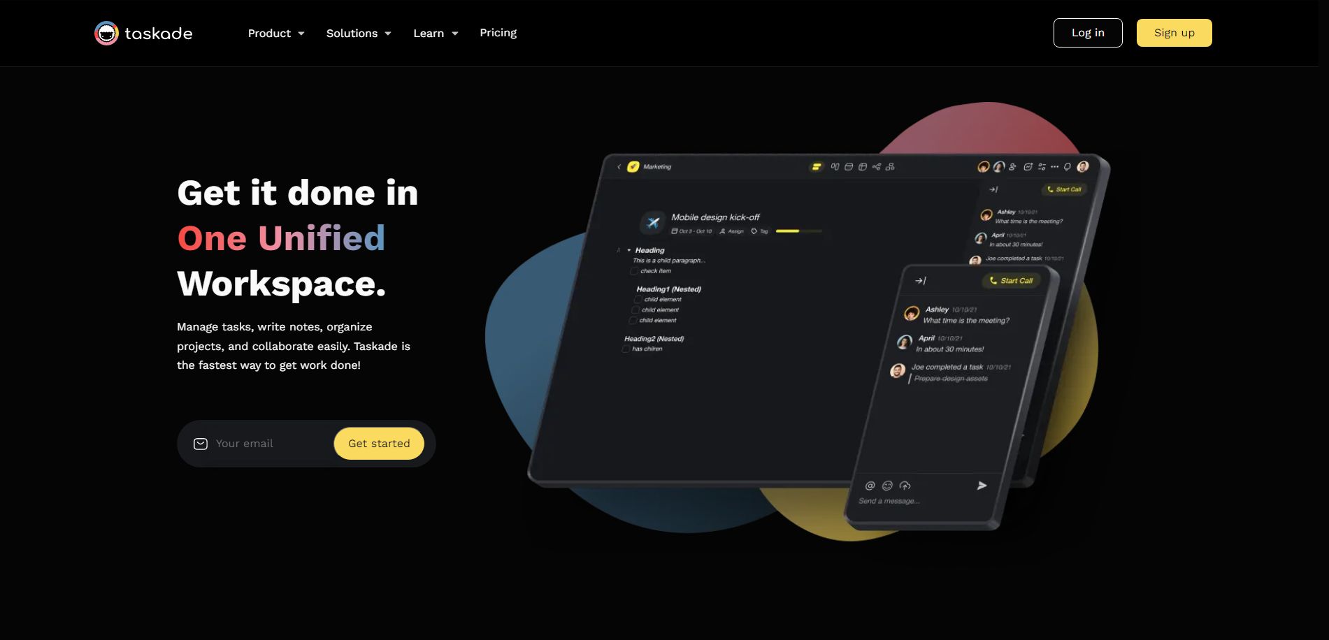
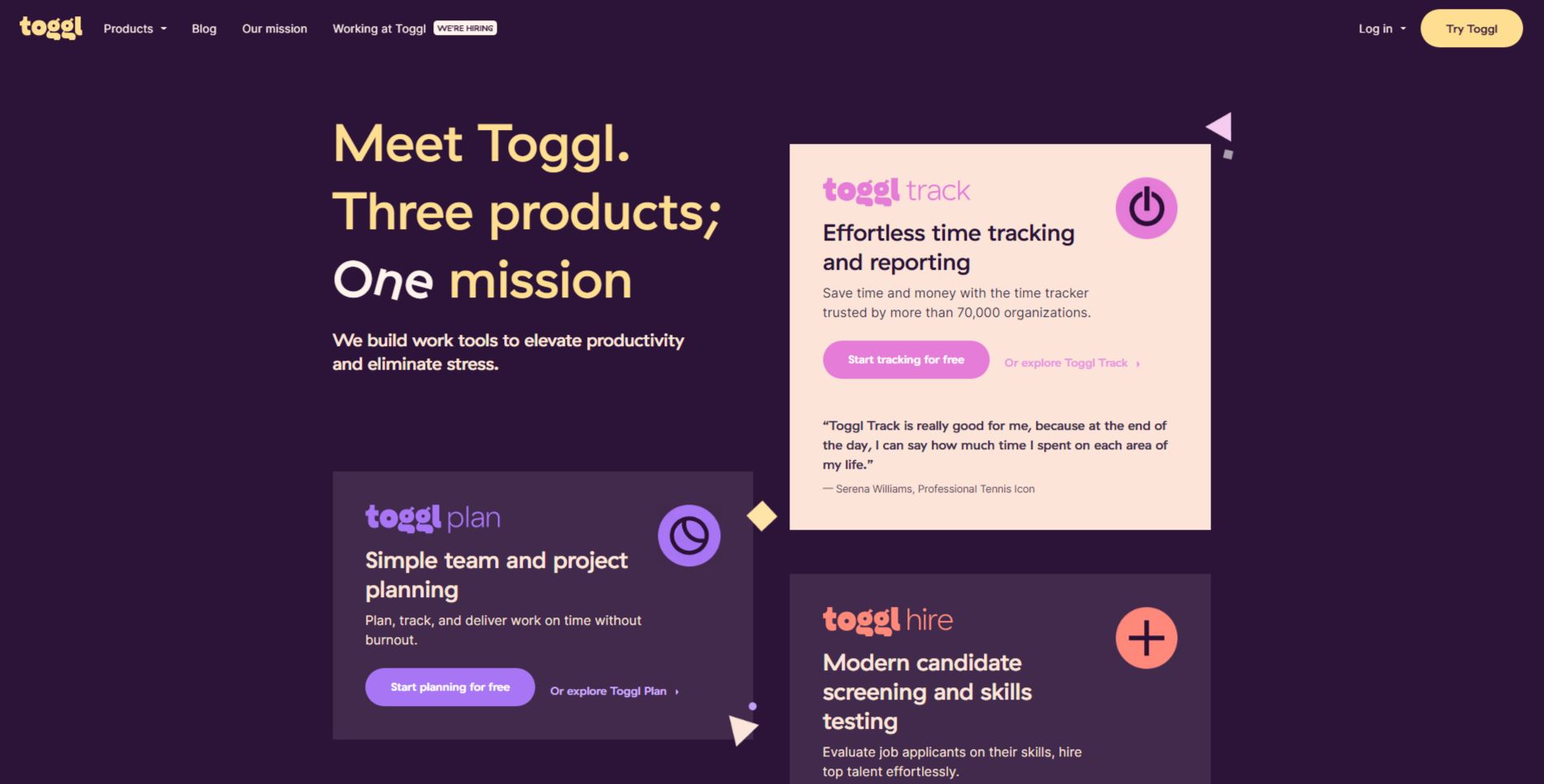
Toggl
We take the stress out of time tracking, project-planning, and hiring. Designed by and for teams that work from anywhere.
View Website
Prev
Previous
Next
Next
Other Saas Hero Examples
View
View
View
View
View
View
View all