
What are the color palettes being used by the designers in order to attract the visuals of the viewer? Do they also sometimes face difficulty in finding the perfect color palette? Yes, of course, even the most experienced designers sometimes find difficulty in choosing a perfect color pattern. Sometimes, they completely rely on the preferences and choices of the clients and more often on the style guides as well, while sometimes when the projects demand designers choose their own color palettes. Here, there are numerous color combinations, color palettes, color schemes, and color designs that are to be looked at. So, in this case, monochromatic designing and color palettes become a sure-shot hit. How come?
The monochrome color palette is very easy to balance and can be hard to mess up. Monochromatic touch changes the look and feels of the design up-side-down. They provide an all-rounder and pleasant touch to suit the designs. As we have already experienced that designers often use simple colors that bring great power to the designs.
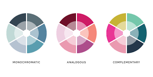
What are Monochromatic Color Palettes:
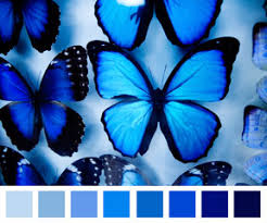
Monochrome color schemes comprise the one basic color from the color wheel and a tint or variation of the same color adds up. The variation that is used here is attained by combining base color with the shades of white, grey, or black. Monochromatic color schemes are suited to almost every kind of design. This is because monochromatic colors provide an elegant style to any design. Monochrome color schemes are easy to make. This in turn would help in improving the brand recognition as well. This is because, soft, monochrome colors attract and comfort the visuals of the eyes that again help in the brand remembrance. Hence, logos with monochromatic color schemes also do well.

How to Use Monochromatic Designs to Your Business:
Lets us now look at ways how we can use monochromatic color palettes for the purpose of designing:
- Decreasing the saturation of the bright colors: A Design looks perfect only if the colors balance out, it is to be ensured that the colors that are bright color schemes that are being used must be in decreased saturation. This is because bold colors often end up tricking the visuals of the viewer as they are unpleasant.
- Continuous progression of the gradients can help. One can use a monochrome color scheme by showing certain progression. It can be in the direction of left to right or might be right to left gradient format.
- The usage of infographics will be the best use of resources: Complexities like the infusion of the infographics sometimes provide a lot of information in a compelled manner. The monochrome color palette helps in organizing the content and also makes the graphics look cleaner and complete which is by using the infographics.
- Sophistication can brighten up the world: Sophistication can be portrayed using the grey monochrome shade. This makes a page or design look cleaner and provides a cooling effect to the eyes. This can also help in providing a unique and more brightened look.
- The creation of contrast makes the designs look elegant. If the dual-colored contrast is a monochrome design, it provides the factor of innovation. It also changes the look and feels of the design as well.
Advantages of Monochromatic Designing:
- A brand logo that has a monochromatic effect or designs to them often comforts the visuals of the viewers. They also help them in further influencing the viewers as well.
- The monochromatic color scheme helps in portray professionalism and this also helps in increasing the value of the design of the products.
- The products designed in monochrome color scheme or palette provide the viewer with a pleasant first impression. Such designs bring their concentration and help them focus on the most critical content. Thus, businesses get to communicate with the targeted group of consumers.
Summing Up:
As we have already explored, that how monochromatic colors and schemes help in evoking the designs and help in lighting up the user experience. Monochromes always will leave an ever-lasting impact on the visual interests of the general public. Here, things become simpler, if the use of similar colors associating with the designs are used. These monochromatic clour schemes can totally work out for the big brands as well as small businesses. The implementation of the designs works well if the contrast is taken into consideration. The game totally depends on the play of different colors, schemes, and contrasts. Likewise, For instance, designers often use two-tone hover action or single-color style will designing a business card. While the options in monochromatic design remain limitless.