
Client: Tristan Bance
Description: Tristan is a growth marketing freelancer and wished to showcase himself better through his website.
Industry: Growth Marketing
Project: Web UI Design
Problem
In the world today when everyone’s online, it becomes important for the individual service providers also to stay updated in the market with the best of the portfolios and projects to be pitched. It not only helps to impress the visitors but also to get hold of the new clients and better opportunities.
Tristan also wanted the same. He wanted to redesign his old portfolio website to stay updated as per the market trends. In this way he could showcase himself and his skills in a better way. He thus wished to have a website that portrays the startup atmosphere and gives out a very friendly tone. The design was required to be clear and simple.
Tristan also had a slight preference for the color of the universe. Blue and orange were how he described it. A few inspirational templates were also shared as samples. With a fairly rich experience and backed up with a powerful portfolio, everything had to be placed in a very simple yet elegant manner.
That’s where we picked it up from!
The Draftss Solution
Understanding the Problem
The brief of the client talked about his color preference, the nature of the communication he wanted his website to have, and the simplicity & elegance he wished to portray. The aim of the website was thus to convey Tristan Bance in a better way to his visitors and potential clients. Some them might not even have heard from him earlier. His past work had to be displayed with utmost efficiency for it to be effective enough to attract visitors for his services and skills.
Draftss follows a very open nature of communication. That is, we have a number of channels for the clients to communicate with us to help maintain the comfort and clarity of the particulars being conveyed. We kept in touch with Tristan Bance constantly upon the email thread. Wee also used to regularly share the progress as well as the outlines of the ideation process.
Brainstorming Solutions & Crafting Results
Our design team with their screens and touchpads on started off with the design of the outline of the idea. The ideation went on for quite some time and clarity started coming in for what had to be showcased upon the screen. We started off with something very minimalistic and plain. Sketched out the layout of the plan and tried to visualize what had to be the perfect fill for all of these spaces.
All of the information, text, and visual content had to fit in perfectly with a very neat and clean interface. Along all those lines that the brief spoke about, we started coming up with something that started looking like a landing page. We redesigned it a number of times with as many iterations as to make it aesthetically pleasing.
We also started sharing the progress with Tristan and with every update he just had to say, “this is exactly what I had actually expected”.
With several suggestions and reviews from both the ends of the client as well as the designing team, we developed a number of design concepts for several other pages and features of the website.
That’s what we do at Draftss – Propose a number of great concepts for a single design to choose from!
Some were loved by Tristan and others were reiterated. With each of the designs getting finalized, the website was looking as perfect as it could’ve been.
The tasks thus started finishing off. We went on to design newsletters, some additional sections, logo for the newsletter, and the design for the onboarding email. Finally, we went onto the phase of integration of the design with the Elementor Tristan had to upgrade to.
With constant feedback, reviews, and fixes, we started developing the design into a full-fledged working web platform.
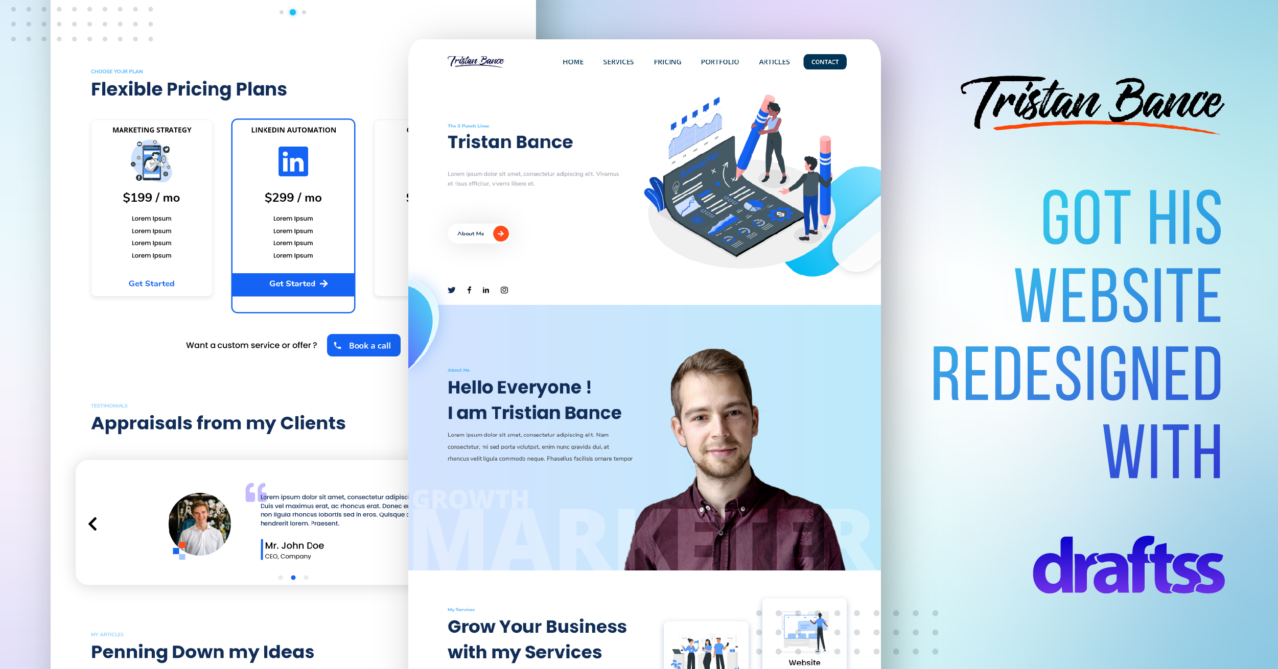
The landing page of the website comes with the preferred blue color. It also stays very soothing to the eyes of the visitors. With simplicity and minimalism embedded in each of the elements of this design, every detail holds the eyes. The navigation was made very easy and different sections of the site have been linked in a highly efficient manner.
With a very sophisticated and sober design of the elements, the theme of the website stays constant with a brief introduction of Tristan Bance. The section had to be crisp, very brief, and very natural in its way. It had to talk about itself and convey more than what is mentioned. Layering one textual color over the other further adds up to the strength of the context.

To convey what Tristan can do for his clients, each and every service he provides is listed in a very embarking and bold font. With those little icons defining more about the text and the section title matching up the color theme, the shadow effect under the boxes adds up to the shine of the section.

With the visuals and logos of the clients, the design makes a very powerful impression upon the visitors for Tristan Bance and his services. The shadow under each of the circles is themed in blue color which even enhances the vibes of the website.

With a very cool and fresh look for the website, Tristan also got a very innovative concept to showcase his fees. Pricing is written on the left-hand side. The right-hand side of the section showcases the process of how Tristan is going to work.

From top to the bottom, every single section has been ideated and worked upon with attention and dedication. This becomes even more visible when a visitor reaches the bottom of the landing page at the footer. The footer of the website is also very different and has got a very fresh look. With designing and innovation in every bit of the section, the website is spick & span with a very cool and trendy look.

Conclusion
With a number of days, and even more emails to take Tristan Bance along the joyful journey of the development of his website design, a website was finally completed. Tristan just had to say, “Wow! This looks great!”
The website is live, up, and running. With additional features like email templates, newsletters, and much more, the website is highly functional and very dynamic. With great efficiency on the desktop version as well as on the mobile, the website has a very refreshing look. It comes with a minimal approach and a very easy navigation experience.
Before the final output, we had a conversation with Tristan on how he wants the specific sections to be displayed. We took all of his final feedback points into consideration. Later, we started integrating the web design with Elementor.
This is how it looks:

Thanks for taking the time to go through our project case study. If you too want to get designs done you can ahead and SIGNUP for 7 DAY FREE TRIAL + Our co-founder loves talking and consulting on projects for free, you can schedule a free call with him regarding your project here calendly.com/junaidansari


