Creating graphic designing in presentation is used to introduce their business to potential clients. But not all presentations are created equal. While it’s true that charisma is key to success, an ah-mazing visual presentation can have a strong influence on your clients’ or investors’ tendency to check out your business. That said, why should you take the design of your presentation seriously? Are visual aids that important? Umm Yes!!
Here are some ways clean, clear, and engaging presentations can help your business:
- Marketing: A presentation that offers clear information about your business can help you attract people and institutions that are willing to fund your app, project, or startup. These investors are more likely to give their money to business owners who have a well-designed pitch deck that can persuade them to get onboard.
- Messaging: You can deliver a great speech but don’t expect listeners to remember and hang onto every word you say. Most people want a simple summary of what your business offers, your goals or objectives, and your plans to get there. A great presentation can help summarize your message to audiences.
- Engagement: The best presentations have visuals and designs that can make audiences laugh, keep them interested and get your points across.
But what, exactly makes a presentation irresistible? How can you sustain your listeners’ interest in your business—instead of feeling they wasted their time?
Draftss has also helped its clients to develop substantial e-commerce platforms with unlimited graphics designs, illustrations, WordPress, HTML, and more for building your website, brand, etc. you can check on our website at draftss.
In this article, we’ll tell you everything you need to know! By the end of this guide to designing presentations, you’ll have the know-how you need to create engaging decks—the kind that will net you, new clients, and customers.
1. Get software savvy
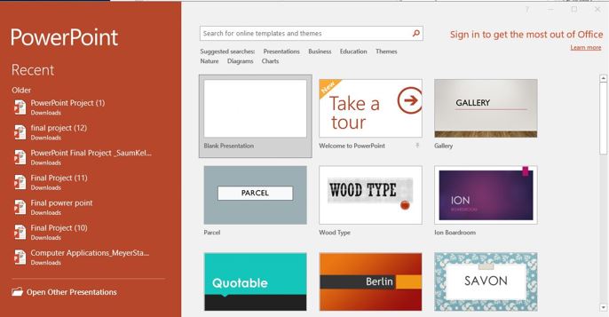
First things first, you’ll need to choose a presentation software that allows you to create professional and clean slides, which represent your business.
The most powerful presentation software include Powerpoint, Keynote, and Google Slides. What’s the difference between these three? Let’s dig into some of the pros and cons of each package:
PowerPoint
Powerpoint is a part of the Microsoft Office Suite and it is very popular amongst Windows users.

Keynote
Keynote is a presentation software application designed for Mac, iOS, and iCloud.
Google Slides
Google Slides is a free, web-based software office suite offered by Google within its Google Drive.
2. Think about content and style
The presentations you create should reflect your business’ style, identity, and personality. If you don’t have a design background, here are a few rules to keep in mind:
Define your brand identity and brand style
No matter what type of promotional material you’re creating, it needs to be in line with your brand’s personality. If your brand were a person, it should visually feel like it. If you’re not sure how to define your brand’s personality, read our guide on brand identity.
Defining your brand’s personality is crucial to your success. Your brand’s style—and therefore the look of your presentation—will depend on your brand’s personality, so get clear on your identity and then define your style based on that. This will give you a baseline for all your brand collateral and everything will end up looking aligned with who you are. For example, if you’re a fun and friendly candy company that uses bright colors in your packaging, using a minimalist theme in your presentation won’t make sense from a branding perspective.
If you don’t already have a brand style guide that defines your look, now’s the time to create one. Here’s how.
Plan your presentation
Next up you need to work out exactly what you want to say. Before you start designing your presentation you need to know what points you want to get across, what information you need to include, and what graphics or charts you want to show your audience.
Once you have a solid plan for what each slide should say, you can start thinking about the design.
Find the right fonts
If you already have brand fonts, use them in your presentation for a consistent look. If you haven’t picked any yet, choose fonts that suit the style your brand is going for. Remember that the best fonts for blocks of text are simple and reliable. With your headlines, you can get more adventurous. For instance, use Arial as the default font for your presentation’s body copy. It’s stylish, super readable, and easily available. Then pick something more unique for your titles. Just make sure to combine fonts that go well together.
Choose your colors
Color is powerful. Color can represent your brand, set the mood for your presentation, impact the audience’s perception, and influence their actions.
Most brands have a color scheme in place, so stick to that palette for the most part. But you also want to think about the tone and purpose of your presentation and adjust your color choice slightly to fit. Check out this guide on color meanings to find out which colors will work best according to color psychology. Are you a tech startup in a new field? You might want to use more serious colors like blue or grey that represent professionalism and dependability. Is your presentation targeting young audiences? Create a youthful color scheme with yellow and orange. Are you in the food, farming, or healthcare industry? Consider incorporating the color green which, according to color psychology, symbolizes growth, prosperity, safety, and endurance. Adobe Color is a good tool to help you pick a color palette.
The more precise you are at choosing your color schemes, the more effective you’ll be at communicating your message.

3. Use icons and images
They say images are worth a thousand words, and rightly so. Researchers call this the superiority effect, meaning pictures enable people to remember things in greater detail and for a longer period, compared to reading. Ideally, you have some high-quality photos that show your business and what you do. Of course, if you’re talking about a product, it’s best to incorporate product photos in your presentation.
You can also get great images on different free stock photography sites, or—if you need something more specific—you can look into paid stock services. Just make sure you don’t pick generic images—get creative and use photos that are unique or create your own.
Pictures are a great way to illustrate your ideas, but you don’t want to go overboard. Use icons throughout your presentation to represent things visually and to leave something to the imagination. You can find icons on sites like the Noun Project, which has more than a million icons you can use for free.
4. Visualize your data

Next, visualize the data you want to include with charts, tablets, and timelines.
Charts
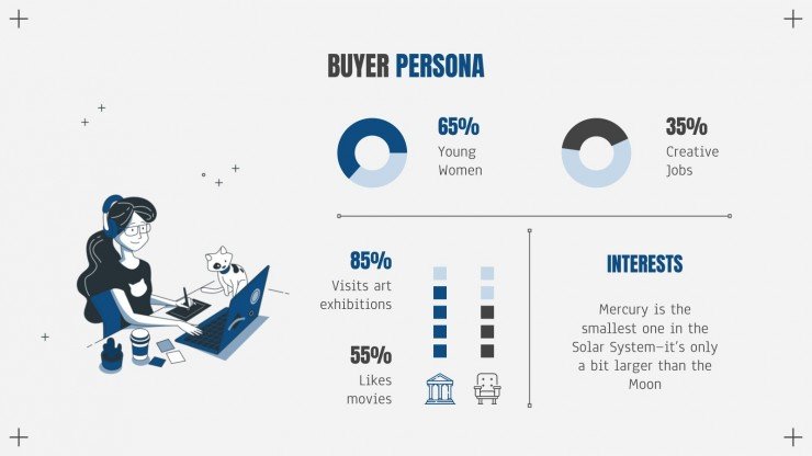
Charts are a popular way to represent numerical data.
A good tip is to use familiar chart types such as area, bar, line, or pie charts. You might be tempted to experiment with unique charts to improve the aesthetic, but it’sMolluscathat more important for your audience to understand the data at first glance.
Remember to also incorporate brand-related colors into your chart for visual consistency and brand recognition.
Timelines
Want to illustrate your plans and projects to potential clients, customers and investors? Use timelines to illustrate events and milestones.
Tables
Tables are the ideal way to represent structured data, comparisons, competition, and financial data.
There are plenty of tools out there that can help you present your data as visually stunning tables, charts, and graphs. Powerpoint, Keynote, and Google Slide all have graph options built in to create graphs or charts, which present your data in a visual and digestible way. However, if you want yours to look more unique, it’s worth designing your custom graphs.
5. Keep it simple
A crucial step is to make everything look professional and polished.
The perfect presentation shouldn’t distract from what you’re saying. Instead, it should support you, offer supplemental information and draw listeners in. You want to keep readers engaged with your vision, products, and business. Effective use of whitespace and a mix of various backgrounds will do that for you.
Use whitespace
Once you’ve added all your images, illustrations, and charts, take a look at the whitespace. Check if there is enough space surrounding each section of text and each visual element. Plenty of whitespaces will make your points easier to understand for your listeners and draw attention to the most important ones.
Also, make sure that your presentation is not too lengthy and that every piece of information is relevant to your audience. Remember to never overcrowd your slides. You don’t want to put too much content on one slide because it’ll seem too cluttered and confusing.
6. Make it interesting
Mix up your background
The background is one of the most noticeable elements in your presentation. That said—you don’t want to use the same background for the entire presentation because your visuals will seem static and boring. On the other hand, you don’t want them to be so attention-grabbing that they take away from the content.
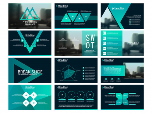
A good tip is to use a mix of backgrounds: filled, plain and image-based.
Now, should you use an image-based background on every third slide? The combinations and sequences you choose depend on the content you’re presenting and which background works best for which piece of information. As long as you remember to mix up your backgrounds, your slides will be engaging and interesting, instead of plain and boring.
Be different
And lastly, try to think outside the box and be a little different. Your presentation will only engage your audience if it has interesting content and visuals that stand out from all the other brands out there. At first glance, your presentation should communicate what’s special about you. Do all your competitors use plain white and grey presentations? Add a little color to yours! Is everyone in your industry using walls of text to make their points? Integrate some nice visuals to make it more interesting. Perhaps it could even be a little funny and tongue-in-cheek if that suits your brand personality. Leap and let your design be a bit different.
Wow, your audience!
It’s not easy to create a well-designed presentation, but trust us, it will be worth the effort. A great presentation can help you communicate effectively with your audience, introduce your business, and net clients or investors.
If you want your presentation design to knock it out of the park, it’s a good idea to find a graphic designer to create it for you. A professional designer will know exactly how to combine text, graphics, colors, and background in a way that gets your point across most effectively and beautifully.
You can try out draftss for an excellent experience and increase your product marketing. We provide premium quality services on unlimited graphic designs, WordPress, Webflow, HTML, Illustrations, Websites, Landing pages, Dashboards, App UI/UX, and many more. Here we provide our clients with 73+ types of design and code services.


