Colors are one of the most impactful ways in which we recognize the world and an important consideration when it comes to marketing. Using the psychology of colors, you can create strong bonds with your prospects from the very moment they network with your brand.
Knowing the reactions that different colors evoke is crucial as we perceive colors on an intense level. Ignorance of the impact of colors can make you intentionally upset people.
The psychology of colors is a field of science that studies how human behavior is affected by colors. Its history dates as far back as the 16th century. Regardless of the controversies and doubts surrounding it, marketers have been able to collect an abundance of data that shows just how drastic a difference the right color makes and the powerful effects that colors have on the success of advertisements.
Smart marketers know that choosing the most suitable color theme for your website is a key factor that ultimately decides how users respond.
Let us explore the exact means by which you can impact people visiting your website by properly using colors.
Basics
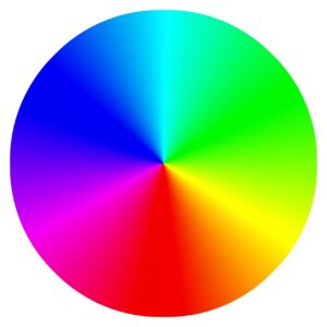
The color wheel is an excellent means to control how your site turns out. It is one of the simplest ways to find out how colors relate to one another. Finding the perfect balance of colors for your website is easier today than ever before, thanks to powerful color wheel picker tools. These tools can help you blend various colors and experiment to find out the best combinations.
Psychology of Colors
An in-depth understanding of color associations is essential when you want to remove the guesswork and not rely only on basic intuitive knowledge.
Now that we know what color psychology is and the use of a color wheel to come up with various combinations, let us take a look at some of the most common colors and their associations in the human mind.
We shall go through different colors and discuss their traits and usage in creating a better website.
Psychology of White Color
Given its universal nature, the color white can successfully be combined with almost any color. Various shades of gray and silver are some very appealing pairing options as these neutral tones combined with white can create beautiful color ensembles.
The color’s clean and sleek traits are naturally alluring to the human eye, which has led it to become one of the most popular colors to use in website design. Owing to its vast range of uses, it should be used in at least part of most websites, regardless of the industry.
Lately, more tech companies have started to use the color more prominently, coinciding with the trend of many designs becoming more minimalistic and uncluttered. The color, however, is especially useful for fields selling high-end and luxurious items and of course, websites of medicine and dentistry.
Psychology of Red Color
Red is a color bearing both positive and negative connotations and consequently can have both kinds of effects on the effectiveness of your site. You should use it economically and combine it with other colors to make the most of it.
The color is perhaps the most powerful on the entire list here. It has a vivid association with blood, which can make their heart beat a little faster, but not strictly out of fear.
The human mind often interprets red as the color of passion, urgency, and sexual energy—the perfect combination for when you are looking to get your visitors to focus their attention instantly.
Red is frequently used to emphasize promotional messages. It is perfect for making the reader feel a sense of urgency when you have an excellent deal for limited time availability.
A popular choice for sports sites, red generates excitement around the world of rat-race competitions. Advertising and marketing websites can well benefit from various combinations and accents of red, but it is vital to maintain a healthy balance to avoid making the site seem pushy.
Psychology of Blue Color
Considered the world’s most popular color, blue is the color for you if you are looking to get people to trust your brand with its soothing effect immediately.
Many popular brands use it as their primary color. Its soothing quality is apt for organizations that would like to seem dependable, like banks, government agencies, and health institutions.
However, use blue with caution if you are someone in the food industry field as the color can reduce appetite and cause an unwanted reaction from your audience.
Use it just enough, and with different combinations to prevent your site from looking cold and distant.
Psychology of Green Color
Not only nature, but the color green has associations with wealth, peacefulness, and even masculinity. The color’s universality makes it ideal for working in a wide range of situations.
Green is one of the most soothing colors on the spectrum and the health, beauty, and even tourism industries are full of websites using green as their primary color, with, of course, good reason.
At the same time, there are situations where green might not be your best bet. Especially if you are part of the luxury industry since green is only seldom associated with sleekness. If that’s the case, black, blue, or shades of gray may be better options.
Psychology of Yellow Color
The perfect color to energize your visitors and showcase your positivity, yellow works really well to present your site as lively and youthful. As a primary color, yellow works wonderfully to make your site look bright and cheerful.
But do not overwhelm your visitors with this bright color. Instead, add touches of yellow to your site to bring your design to life.
A word of warning, use yellow scarcely if you are a high-end company as it sometimes has the opposite effect of what you’re looking for.
Psychology of Black Color
If you are looking to make the forefront of your design look elegant, sleek, and timeless, then black is the color you’re looking for as it will help you bring together all those associations.
Designers who are bold enough to go heavy on black have had massive success as the color never fails to capture the audience’s attention. If your goal is to make a statement, deciding on black as your primary color is a bold way of doing just that.
Certainly, there are risks around accessibility by potentially making your site difficult to read. Therefore, not to overwhelm your audience, use pitch-black accents carefully as they might have the opposite effect of what you want. There are even cases where black has negative connotations, as it can symbolize uncertainty and darkness.
Be sure that the advantages of the color outweigh the potential risk factors. Analyze your audience carefully to find whether sleekness is the effect you are looking for.
Black might be just the right color for you if you are associated with fashion or high-end consulting, as they are fields where making a statement is an absolute necessity. This choice will help you to resonate with the best customers you can attract.
At the End
Analyzing the features of various colors can help you get a better idea of what colors might be best suited for your website. Use the color wheel judiciously to look for combinations, and you will never run out of options to consider and will be able to charm your audience with incredible combinations.
The psychology of colors is a science that is yet in its evolving stage. That is not to say that there aren’t plenty of insights to combine the best colors matching the goals of the brands and websites.


