Color psychology majorly contributes to the determining factor on which the success of your website could depend on. Using it in the right way for the right audience at the right place is crucial.
What we find to be triggering a positive or negative response in the mind, impacts our attitude and decision-making almost instantaneously. One such ubiquitous trigger that we come across and really do not think of much is the colors surrounded by. Being able to employ the right color scheme can certainly be an additional feature to make your creation more attractive as well as generate the optimal response.
User Experience In Color Psychology
When it comes to creating the new website that makes the user experience fulfilling. One of the key points to keep in mind is that the website should be simple yet appealing and inviting. Colors have a remarkably close link with emotions and hence have a definite psychological impact. The warmth or coolness of color evokes different feelings in the brain. Hence, in order to achieve the goal, the website puts up for. The user experience and user interface need to be a high priority.

Color psychology is one tool that’s used to make the website more appealing by engaging with the subconscious emotional system of the user to drive them to the expected results. Obviously, different colors can impact different responses depending on the circumstances, both negative and positive. This property of colors used by designers looking to create a more engaging website that can hook onto the user’s attention.
When choosing the color scheme for a particular crowd, a designer must remember what appeals. The most to the crowd without using too much or too little of the scheme chosen.
According To Recent Studies
Women are more attracted to the colors blue, purple and green as opposed to orange, brown and grey. Knowing when to use these colors to attract more women. To use the website and further even to buy the products offered. By creating a female-oriented and classy website is what the designer should aim for.
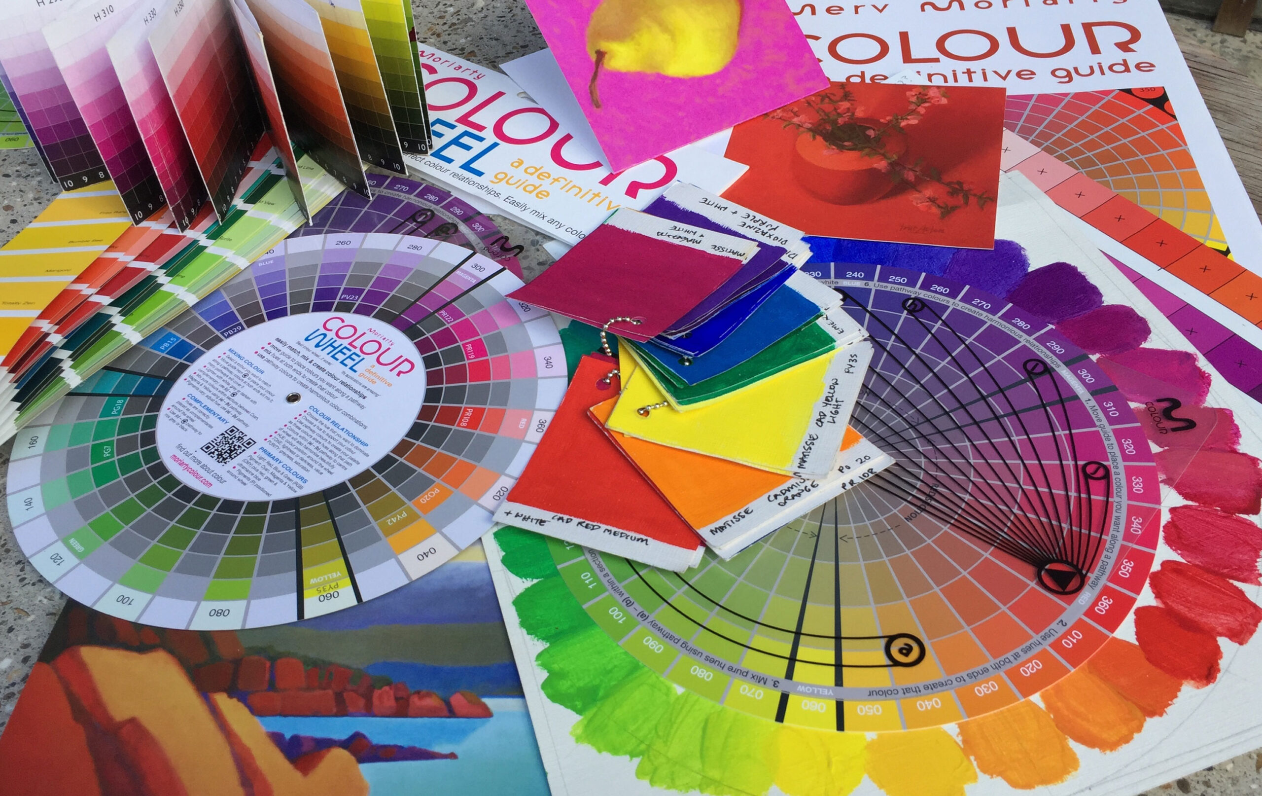
Here is a list of colors and the groups of people that find the color most appealing:
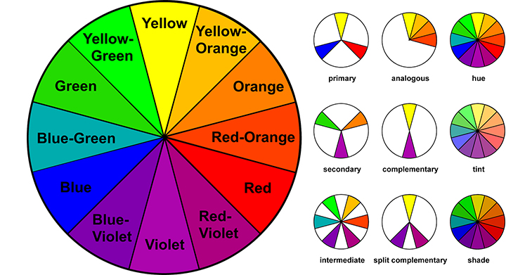
The Color Psychology Of Blue, Green, Orange, Red And White
Blue- It is the thought of as the color that builds the user’s trust. This color used in most scenarios as it can be found to build trust and imply transparency. It can seen in the real-time example of Facebook. A social media company having billions of users across the world.
Green- It’s used mostly to promote the outdoors and the environment due to its calming presence as it’s associated most with nature awareness and appreciation. This color also associated with a confirmation.
Orange- Known to be the ‘Impulse’ color, Orange can see the imply in competition and push for a rapid response in case of urgency. It can also used in sports team logos to show physical activity and confidence.
Red- Used to draw immediate attention in case of a threat or warning. Also associated with a negative response to incorrect input by the user. It’s the warmest color which seen in both extreme positive as well as negative scenarios such as passion and danger.
White- Most often it is a color of purity, virtue and hygiene. It has a sense of cleanliness and honesty which is why it’s often used by several healthcare companies. This color also used to make content stand out of the page.
The Color Psychology Of Yellow, Purple, Pink, Brown and Black
Yellow- Another warm color that associated with both positive and negative emotions and used sparingly as it can get overwhelming if used excessively and mostly used to put out a warning as it can grab attention very easily.
Purple- Said to be the color of royalty and wealth. This color also used to invoke calmness and serenity. Also, it can develop creativity, curiosity and mystery.
Pink- Closely related to femininity, sensitivity and romance. Hence, it’s mainly found in female generated online markets.
Brown- It creates a feeling of content and homeliness. It suggests stability and makes you feel down to earth.
Black- Reflecting elegance and glamour, it’s used in advertisements to show power and high contrast. This color used to show high class and standard in a particular product as it can seen in automobile ads.
Over To You
As seen above, different colors hold different impressions in the brain which can lead the user to have their own interpretations of a certain website. This interpretation can formed with the help of the user interface, making it more attractive and appealing. More so, to make the website a success, this color psychology helps capture a lot of attention from the right crowd for the right product at the right time making the effort put in by the designer a lot more credible.


