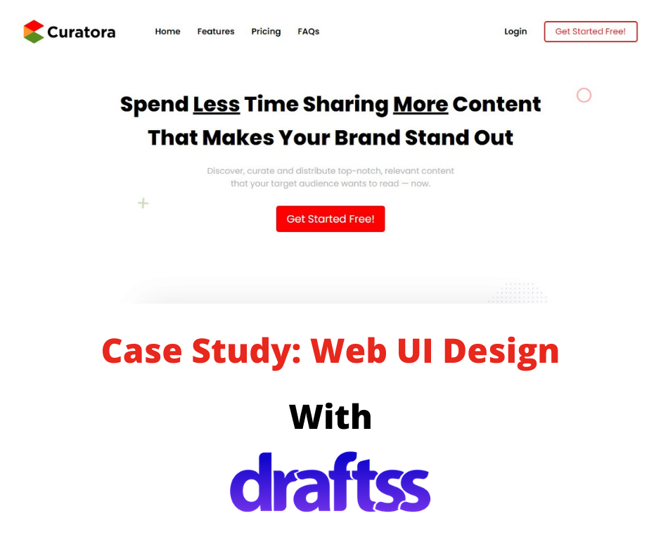

Company: Curatora
Description: Curatora helps businesses to discover & curate high-quality fresh content and boost social media.
Industry: Content & Social Media
Project: Web UI/UX Designing
Problem
Curatora wanted a brand new web design to enhance the user experience for their visitors and drive more traffic to their website. The outlook of the business is one that is attractive and trendy and so should have been the website. Curatora works for its clients to offer them great content that makes your brand stand out. A brand that takes care of other brands to stand out has to stand out in the competition for itself.
Curatora wanted to get a website designed that is attractive, trendy, and modern. At the same time it had to be very easy to use for its visitors and navigate around. All of this was to be combined into a single design of the website. More illustrations had to be added to make everything just pop out of the screen and catch the eyes. Keeping the website consistent, several sections had to be added. The colors preferred were just the three: Yellow, Green, and Red.
The Draftss Solution
Understanding The Problem
The brief from the client talked much about the interface and color combination of the design. It was clear that the final aim of the complete design was to come up with a design that is eye-catchy and very active. Our team of designers rolled up the sleeves and kick-started the project. With a number of illustrations and eye-catchy color combinations, our team started putting all of it together on their screens.
To keep in touch with the client and the feedback, we used to have regular zoom calls with the client. Every time we did, it wooed the client! With several presentations of different concepts, many horizons to the same design, and different combinations of colors, we had to reach that one perfect design that fits all of the mentioned requirements.
Brainstorming Solutions & Crafting the Results
What we came up with was something not just around perfect but perfect! The team came up with a web design that was minimalistic and at the same time packed up with bright colors as per the preference of the client. With everything very attentive and bold, it gave a sense of activity and energy which is wooing the visitors continuously. The website had to also be the best version of itself on both the platforms – on desktop as well as on mobile. We started with developing a basic version on the Adobe XD. Later, we pushed the design towards finishing with constant inputs and ideation.
With a very minimal and plain background, the website design looks bold and attractive. It throws the bright orange out towards the visitors. We developed the design to make it just effortless for the users to search for relevant information and make every bit of the content attentive to the eyes and catchy enough.

The website should have been interactive as well as enough to say it out loud for the services of the company. We created a GIF representation for the complete process of how Curatora lets its users create great content and it worked well!
 With a crisp and short description of the step-by-step process, a small picture next to it with some labeling pointers give it a flavor of visual elements and a better outlook overall. This also makes the design a perfect blend of text and visual content and further enhances the customer experience.

One of the most important sections for any business is the information about subscription plans. Also, we listed all the plans horizontally with all the services in the vertical columns. Each subsection additionally comes with a very slight hover effect and a grey shadow effect. We developed it with an intent to make the design look even more interactive and responsive.

We designed the footer of the website in an off-white color. It comprises perfectly aligned information with a very clean look. With two icons for the users to download the app of the service provider, we added a resourceful link to the section. With all the pages linked to the respective titles, here’s how it looks!
Conclusion
Curatora now serves its online visitors with ease and enhanced features. Users can directly login to the portal and start availing their content services. The landing page is bright and trendy as per the requirement. The content also fits the page with enough space and a matching font. With all the relevant information on the landing page of the website, it becomes, even more, easier for the visitors to access the information with decreased navigation around the website.
The final version is very minimal, and of a very sophisticated background with bright and bold colors. It usually is very difficult to have a great design leaving the background empty. But the skills of our great designing team made the empty space give the glow and spark to this web design.
With elegance and beauty on the top, the design looks bold and strong.
The final output took some fixing and changes based on the recommendation and ideas from the Curatora team and our senior design team at Draftss.

Here’s how it looks when it finally is live: Curatora.io
Thanks for taking the time to go through our project case study. If you too want to get designs done you can ahead and SIGNUP for 7 DAY FREE TRIAL + Our co-founder loves talking and consulting on projects for free, you can schedule a free call with him regarding your project here calendly.com/junaidansari


